How to Optimize Images in Angular with NgOptimizedImage
You have a beautiful hero image for your new product launch. It’s crisp, detailed, and perfectly showcases your item. But when a customer visits your site, they see a blank space for three long seconds before that image finally appears. By then, their patience has worn thin, and they might just click away. This delay, especially for the most important visual on your page, can directly impact user experience and sales. Slow images are a common problem, but modern web frameworks like Angular have built-in solutions to tackle this.
While the underlying technology can be complex, understanding the principles of modern image optimization is straightforward. It involves loading the right image, at the right size, and at the right time. A specific tool within Angular, called NgOptimizedImage, automates many of these best practices, ensuring your website feels fast and responsive without requiring manual configuration for every image.
What Is NgOptimizedImage?
NgOptimizedImage is a directive within the Angular framework that enhances the standard HTML image tag to enforce performance best practices automatically. Think of it as an intelligent assistant for your website’s images. Instead of just telling the browser ‘here is an image,’ it provides a set of advanced instructions to load that image most efficiently. This includes prioritizing critical images, preventing content from jumping around as the page loads, and serving appropriately sized files for different devices.
By using this directive, developers can ensure that your site follows Google’s Core Web Vitals guidelines, which are important for both user experience and search engine rankings. It automates tasks that were once complex and manual, such as generating responsive image sizes and implementing lazy loading. The goal is to deliver a faster, smoother experience for your visitors with less development effort.
Prioritizing the Most Important Image
The Largest Contentful Paint (LCP) is a metric that measures how long it takes for the largest visible element on the screen to load. This is often a homepage banner or a main product photo. A slow LCP makes a page feel sluggish. The NgOptimizedImage directive helps solve this by allowing developers to mark this key image as a priority. When an image is marked this way, the browser is instructed to fetch it immediately with high priority, even before other scripts or stylesheets. It also preloads the image on the server, so it’s ready to be sent to the browser as soon as possible.
Imagine you’re at a busy restaurant. Marking an image as ‘priority’ is like telling the kitchen to prepare your main course first, even before the appetizers for other tables. All other, less critical images on the page are automatically deferred, ensuring that the first thing your visitor sees is the most important content, fully rendered and ready.
Preventing Jarring Layout Shifts
A common frustration on the web is Cumulative Layout Shift (CLS), which happens when page content moves or jumps around as media loads. You might try to click a button, only for an image to load above it and push the button down, causing you to click on something else entirely. This creates a poor user experience. NgOptimizedImage combats this by requiring developers to specify a width and height for every image. By defining the dimensions upfront, the browser reserves the exact amount of space for the image in the page layout before it even starts downloading. The space acts as a placeholder, so when the image finally appears, it fits perfectly into its designated spot without shifting any other content.
By enforcing that image dimensions are always declared, this Angular feature effectively eliminates one of the primary causes of layout shift, leading to a more stable and professional-looking website.
Serving the Right Image Size for Every Device
Serving a massive, high-resolution desktop image to a mobile phone user wastes their data and slows down page load times. The correct approach is to use responsive images. NgOptimizedImage automates the creation of a srcset, which is a list of different-sized versions of the same image. It tells the browser, ‘Here are several sizes of this product photo; pick the one that best fits the user’s screen.’ A phone on a 4G network might get a 480-pixel wide image, while a user on a 4K desktop monitor gets the 1920-pixel version. This ensures fast loading times and efficient data usage for everyone.
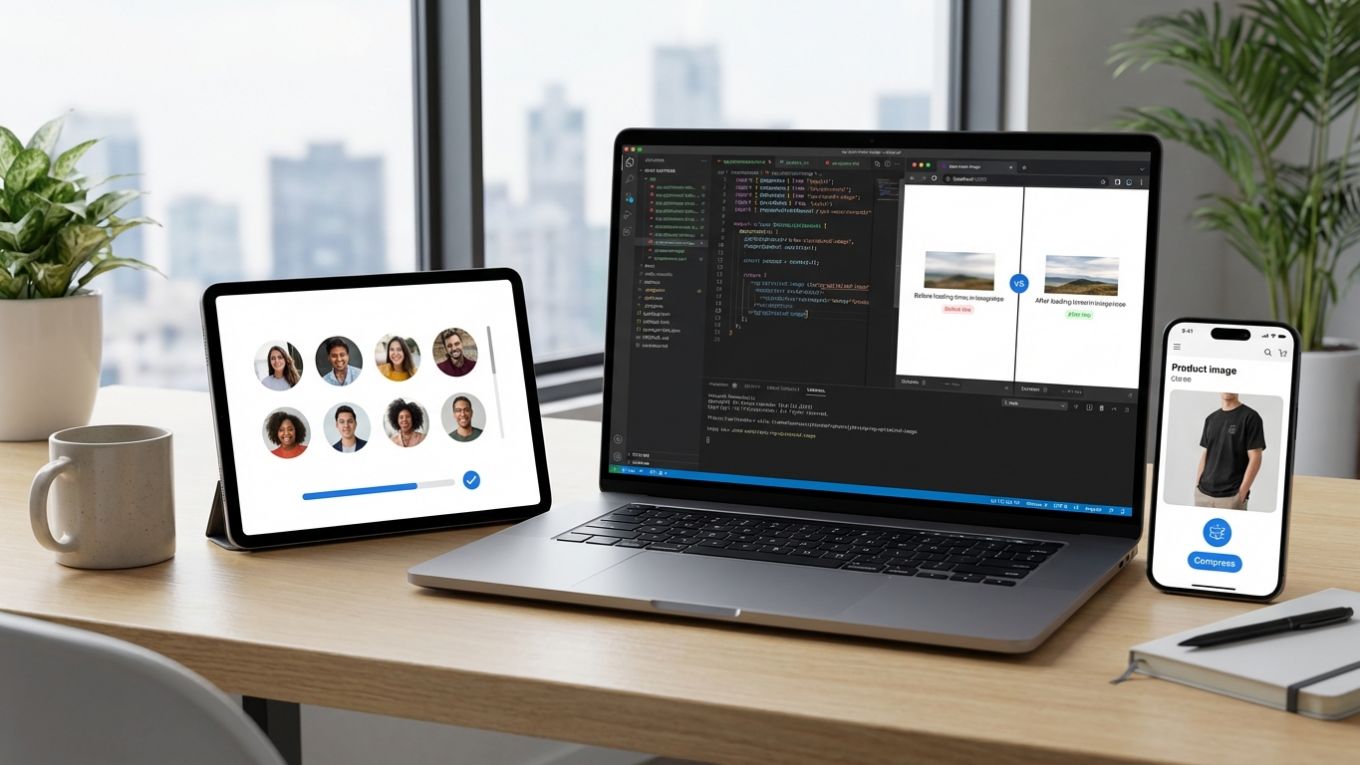
This process works best when the original image is already optimized. Before your developer even gets the file, you should run it through an online image compressor to reduce its initial file size without sacrificing quality. Starting with a smaller base file means every version generated by the srcset will also be smaller, compounding the performance benefits. To learn more about this topic, you can explore this guide for faster websites.

Lazy Loading Non-Critical Images by Default
Lazy loading is a technique that defers the loading of off-screen images until the user scrolls near them. This approach prevents wasting bandwidth on downloading images in the footer of a page if the user never scrolls that far. With NgOptimizedImage, this behavior is the default for any image not marked as a priority. This significantly improves the initial load time because the browser only has to download the content visible in the viewport. The rest of the images are loaded on demand, making the page interactive much faster.
For an e-commerce category page with dozens of products, this is incredibly effective. The first few rows of products load instantly, and as the shopper scrolls down, the next rows appear smoothly. This provides the perception of a very fast website, even on pages with hundreds of images.
Advanced Features for a Polished Experience
Beyond the core optimizations, the directive includes features to refine the user experience during loading. One such feature is the ability to show image placeholders. While the high-quality image is loading, a very small, blurred version can be displayed in its place. This avoids jarring blank spaces and signals to the user that content is coming. This technique gives the page a more fluid and professional feel.
Another useful option is the ‘fill’ mode. This allows an image to act like a background, stretching to fill its parent container. This is perfect for creating hero banners or full-width promotional sections where you want the image to adapt perfectly to a predefined area without leaving empty gaps. For example, you could have a promotional banner for a sale, and the ‘fill’ mode would ensure your product photo completely covers the banner area on any device, from a narrow phone to a wide desktop screen.
Optimizing images is not just a technical task for developers; it is a key part of creating a successful online presence. Using a modern tool like Angular’s NgOptimizedImage automates best practices, leading to faster load times, a better user experience, and improved SEO. Your immediate action is to ensure your source images are as efficient as possible. Before uploading any new photo to your site, run it through a compression tool to minimize its file size. This simple step provides a solid foundation for all other technical optimizations to build upon.
FAQ
What is the most important image to optimize on a webpage?
The most important image to optimize is the Largest Contentful Paint (LCP) element. This is typically the main hero image or banner at the top of the page, as its loading speed heavily influences a user’s perception of your site’s performance.
Does optimizing images really make a website faster?
Yes, absolutely. Images are often the largest files on a webpage by file size. Optimizing them through compression, proper sizing, and lazy loading can dramatically reduce load times and improve your site’s Core Web Vitals scores.
Can I use these techniques on my WordPress or Shopify site?
The NgOptimizedImage directive is specific to websites built with the Angular framework. The underlying principles—compression, lazy loading, responsive sizes (srcset), and preventing layout shift—are universal best practices that can and should be applied to any platform, including WordPress and Shopify, often through plugins or theme settings.
What is layout shift and why is it bad for users?
Layout shift is when content on a webpage unexpectedly moves as it loads, often caused by images appearing and pushing other elements down. It’s bad for users because it can cause them to accidentally click on the wrong link or button, creating a frustrating and jarring experience.
Compress images without losing quality