HTML Responsive Images srcset: 6 Fixes for LCP (2026 Guide)
Better Largest Contentful Paint (LCP) and smoother mobile loading often comes down to one thing: stop sending oversized images. With html responsive images srcset, the browser can choose an appropriately sized file for the current viewport and device pixel ratio, cutting wasted bytes without making product photos look soft.
Shipping one “hero” JPEG to everyone is the common failure mode. If you run an e-commerce catalog or a content site, the LCP element is frequently an image; when that file is heavier than it needs to be, you pay twice—slower rendering on phones, plus extra bandwidth on repeat views.
You don’t need manual resizing for every page. You need a repeatable setup: pick the right descriptor style (x vs w), state the real slot sizing with a sizes rule, then generate a breakpoint set that balances speed and cache efficiency for high-volume product photography.
Steps to implement html responsive images srcset and sizes
A reliable implementation pairs a candidate list with an explicit rule for how wide the image will actually render across your layout. If you ship candidates but don’t give a dependable slot-size rule, the browser often plays it safe and downloads a larger resource than you expected.
Start by deciding whether the component is fixed-width or fluid. Fixed-width blocks—say a product card image that always renders at 320px—fit density switching. Fluid layouts—like a grid that becomes 50vw, then 33vw, then 25vw—need width candidates plus a sizes rule that matches your CSS breakpoints. That’s the model described in the MDN responsive images guide.
Measure the rendered slot at each breakpoint, not the full viewport. The browser makes its selection early, so treat your HTML as the contract for image choice. If you use a framework image component (for example, Next.js), verify what it outputs and whether it matches your layout; the guide at the Next.js Image component helps you spot common output mismatches.
- Pick one strategy per image: density switching (x) for fixed slots, width switching (w) for fluid slots.
- Write a sizes rule for every viewport range so the slot width is never ambiguous.
- Generate enough width variants so the browser can land close to the real slot instead of overshooting by a wide margin.
- Cap the largest candidate at the intrinsic image size to avoid accidental upscaling.
- Prefer modern formats like WebP and AVIF, but keep a practical fallback.
Imagine a Shopify storefront with a responsive product grid. On mobile, the card image is near full width; on tablet, it’s roughly half width; on desktop, it drops to about a quarter. That’s a fluid slot, so you’ll use w-descriptors plus a sizes rule tied to your CSS breakpoints—smaller downloads on phones, yet still crisp on high-density laptop screens.
MDN calls this “resolution switching”: you provide options and the browser chooses the most suitable file for the current screen density and layout. The key is that your sizes rule needs to reflect reality, not what you wish the layout did.
Differences between x-descriptors and w-descriptors
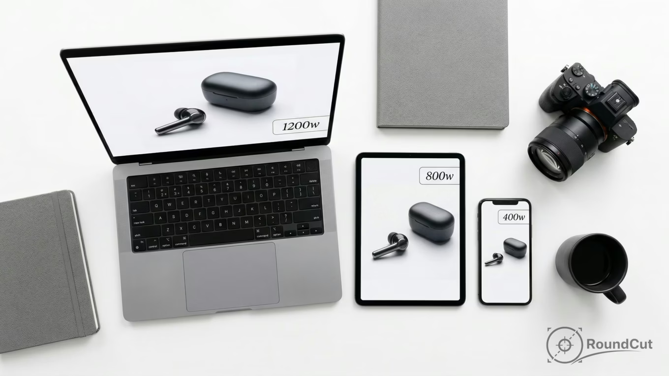
x-descriptors choose an image based on Device Pixel Ratio (DPR) for a fixed rendered width. w-descriptors choose an image based on the rendered slot width and DPR, which is the safer default for most fluid layouts.
Use x-descriptors when the on-page display size is stable: a component that always renders at 400px can stay sharp on 2x screens by offering 1x and 2x resources. Use w-descriptors when that same component might render at 360px on mobile, 520px on tablet, and 700px on desktop; then you need widths plus a sizes rule so the browser can pick the closest match for each range.
- x-descriptors (1x, 2x, 3x): best for fixed layouts with stable CSS width; you specify one intended rendered width and provide DPR steps. Skip this when the rendered width changes with viewport or container size.
- w-descriptors (480w, 800w, 1200w): best for fluid layouts; you specify width candidates plus an explicit sizes rule. Skip this when you cannot define slot width reliably.
For product photography, the same asset often appears in multiple contexts—grid cards, hero placements, carousels. w-descriptors let each context request an appropriate width without duplicating your original upload into separate “versions” by hand. If you serve images via CDN resizing, you can generate those widths on demand while keeping one master file as the source.
Use the responsive img srcset example pattern as a mental model: one image, multiple width options, explicit slot widths, predictable selection. If you use the html source srcset attribute inside a picture-based setup for art direction, the same trade-off still applies: widths and sizes for fluid slots, densities for fixed slots.
The W3C note on the srcset attribute explains why these adaptive candidates exist and how browsers evaluate them.
Automating srcset generation for high-volume catalogs
Automation means storing one high-quality original and generating a consistent set of variants per layout class. Once you standardize a few breakpoint sets, you can apply them across your catalog without hand-tuning every SKU.
For product catalogs, cache behavior and operational simplicity matter. Generate too many variants and you hurt cache hit ratios while making invalidation harder; generate too few and the browser is forced into oversized downloads. A pragmatic target is a small number of reusable breakpoint sets aligned to your components (card, gallery, hero), applied consistently across the site.
On the implementation side, you have two durable routes. Route A is build-time generation in your pipeline using an image library like Sharp image processing library, producing WebP or AVIF plus a fallback format. Route B is CDN transformation URLs that generate widths dynamically. Choose Route A when you control deployment and want deterministic artifacts; choose Route B when you need late-stage quality or format changes without rebuilding.
- Define 2–3 layout classes and assign each a breakpoint list and aspect ratio policy.
- Generate modern formats with a fallback, and keep color space consistent.
- Never generate wider than the intrinsic image size so you don’t bake in upscaling.
- Track where each image is used so breakpoint sets are reused instead of multiplied.
- Log which candidate gets chosen per request so you can refine breakpoints with real traffic.
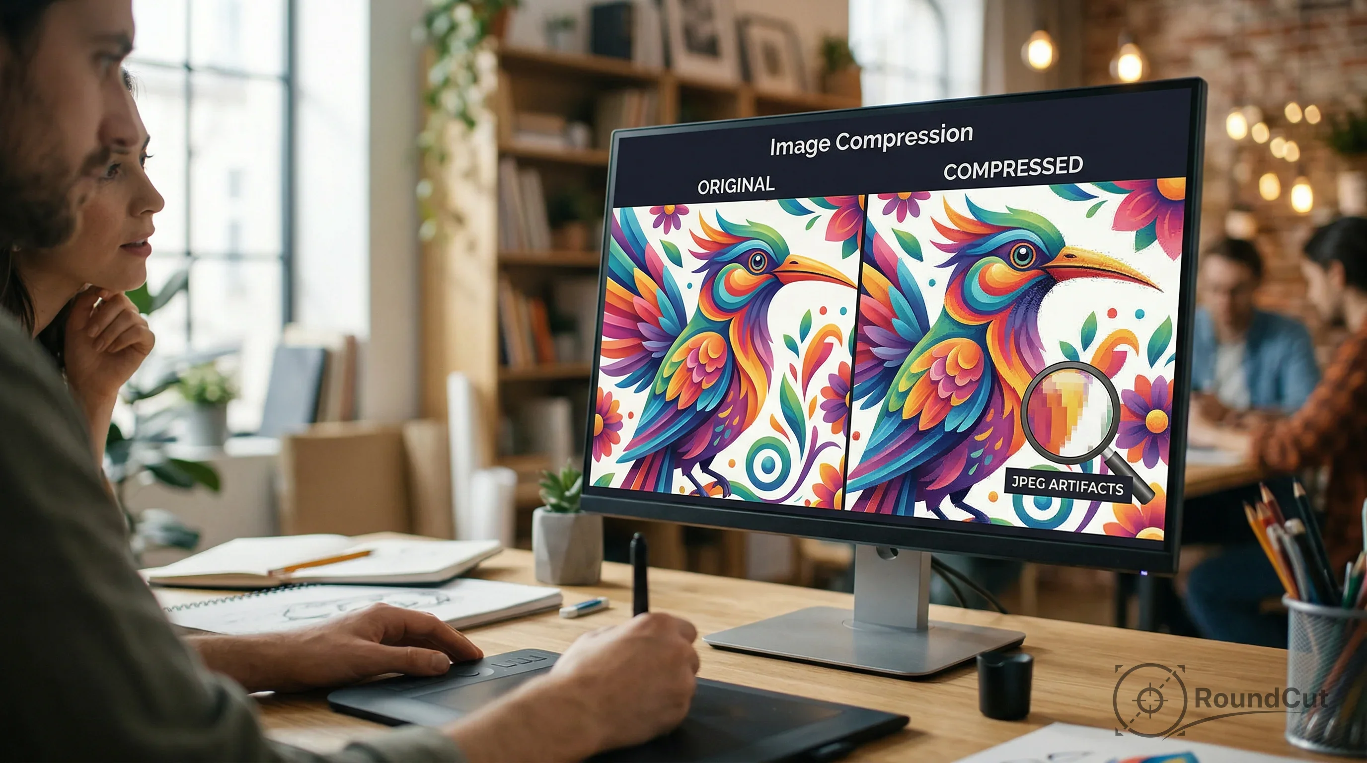
Asset prep still matters, though. If you remove a background to keep catalog styling consistent, export the result at sensible quality, then run an online image compressor before it enters your pipeline. That reduces storage and speeds up processing, especially when you batch-generate variants for thousands of items.
And if the same catalog image also becomes a profile avatar or seller badge, a circular crop helps keep presentation consistent across the UI—then responsive delivery keeps that circle lightweight on mobile while staying sharp on high-density screens.
Choosing optimal srcset breakpoints for LCP on product pages
Good breakpoints minimize wasted pixels: the gap between the chosen candidate width and the rendered slot width, multiplied by DPR. You want candidates close enough that the browser rarely downloads far beyond what it can display, yet short enough lists that caches stay warm.
Treat breakpoint selection like a performance budget with a cache constraint. If your layout has a predictable set of slot widths, cluster candidates around those slots for common DPR values. If the layout is truly fluid, use a geometric progression to keep step sizes reasonable, then refine based on selection logs.
Start with three anchors and expand only when you see frequent overshoot in audits: a small mobile width, a mid tablet width, and a desktop width sized for your typical container. Keep the set consistent across your catalog so caching stays predictable. If you need to reframe images for consistent cropping, a free crop image tool can help you standardize aspect ratios before variants are generated.
- Product grid card: slots near 90–100vw on mobile, 45–50vw on tablet, 22–30vw on desktop; try 480w, 800w, 1200w because it matches common slots and limits variant sprawl.
- PDP main image: wide but bounded container; try 800w, 1200w, 1600w to protect LCP while staying close to the rendered size.
- Thumbnail strip: small fixed boxes; use density switching with 1x/2x because the slot is stable.
- If the component’s CSS width is stable, use x-descriptors.
- If the CSS width changes with viewport or container, use w-descriptors plus an explicit sizes rule.
- If the image is the LCP element, keep breakpoints tighter around that LCP slot so the first paint doesn’t drag.
This is the intent behind image optimization srcset: you’re shaping selection behavior so the browser requests the right bytes for the slot at the right time.

Fixing responsive images that load at the incorrect size in Chrome
When images load at the “wrong” size, the usual cause is a sizes rule that doesn’t match the CSS, not Chrome ignoring your candidate list. If sizes is missing or mismatched, the browser falls back to a default slot assumption that often pushes selection toward larger files.
Chrome’s selection logic depends on the declared slot width and the device’s DPR. If your CSS renders an image at 320px but your sizes rule implies full viewport width, Chrome will pick a much larger candidate. sizes only affects width-descriptor candidates; that’s why w-descriptors plus a correct sizes rule are the safer choice for fluid layouts.
Debug it like a checklist, not a guessing game. Open DevTools, inspect the image request, and verify three things: the chosen candidate width, the computed layout width of the element, and the DPR. Then fix the mismatch at the source—either the slot rule or the CSS. If you use a picture element for art direction, also confirm which source matched your media query before you chase widths.
One quick sanity check: are you accidentally telling the browser the slot is bigger than it ever is? That single mistake can erase most of the performance win.
- Confirm the element’s computed rendered width and compare it to your intended slot.
- Confirm DPR and test at 1x and 2x.
- Verify you are using w-descriptors when relying on a sizes rule.
- Watch for CSS that changes widths after initial render (lazy-loaded grids and late font swaps can do this).
- Audit your LCP element and treat its candidate choice as performance-critical.
For a deeper performance frame around Core Web Vitals, see how to optimize images for page speed and Core Web Vitals. Responsive delivery pairs with that approach because LCP improves when you reduce the initial image bytes.
Using picture-based art direction versus srcset alone
Use art direction when the right image needs a different crop or composition, not just a different file size. srcset alone solves resolution and sizing; art direction swaps to a different asset when the layout changes what should be visible.
Product photography sometimes needs art direction for banners and editorial blocks—wide hero framing on desktop, tighter subject framing on mobile. Each variant still needs candidates that match its own slot sizes, because sharpness and byte weight are separate concerns. Keep variant counts bounded, though, or cache efficiency collapses.
Format choice matters in art-direction flows. If you’re deciding between PNG, WebP, and AVIF for transparency, read best file format for transparent images. Then align responsive output to that decision: one crop policy per breakpoint, one candidate set per layout class, modern formats where supported, and a fallback where needed.
- The subject must stay centered or readable across layouts.
- You need different crops, not just different widths.
- You cannot guarantee a single crop will work on both mobile and desktop.
Recommendation: default to width-based responsive selection for catalog images, but reserve art direction for editorial or hero placements. Disqualifier: avoid art direction for every SKU image in a large catalog unless you have strict automation for crops and variants.
Pick one image template and implement it end-to-end: define slot widths, generate candidates, validate in Chrome, then roll it out across the catalog. Treat the LCP image as the first priority, and keep breakpoint sets consistent so caching stays predictable—even though you’re serving multiple sizes.
Implementing html responsive images srcset well comes down to clarity: the browser needs realistic slot sizing, sensible candidates, and a bounded automation plan. Do that, and page weight drops while LCP improves—especially on mobile product pages where one oversized image can dominate the whole load.
Start with your most important product images, then standardize: choose x for fixed slots, w plus sizes for fluid slots, and keep breakpoint sets reusable across components. If your input files are unnecessarily heavy, compress them before they hit your pipeline so every generated variant starts from a manageable baseline.
If your next step is get the correct social media image sizes for 2026. this guide covers optimal dimensions for instagram, facebook, and linkedin posts and stories, The Ultimate Social Media Image Size Guide for 2026 is a dedicated option for that workflow.
FAQ
Do I need to support DPR values above 2x?
Many laptops and phones exceed 2x density. If you use width candidates with a correct sizes rule, the browser accounts for DPR automatically without you hardcoding every density step.
Can I rely on JavaScript to swap images after load?
Don’t rely on JavaScript for first-load image selection. Browsers often start fetching early, and late swaps can trigger two downloads, which hurts LCP and wastes bandwidth.
How many width candidates should I generate per image?
Generate enough options that the browser rarely overshoots the rendered slot by a large margin, but keep the set small to stay cache-friendly. A reusable set per layout class usually works best.
What is the fastest way to verify I fixed the sizing problem?
In DevTools, compare the chosen resource width with the element’s computed rendered width and your DPR. If they don’t line up, fix the sizes rule or the CSS so the declared slot matches the real layout.
Will responsive images alone solve my performance issues?
Responsive images ensure you send the right bytes for the rendered slot, which directly helps LCP. You still need modern formats and stable layouts to avoid layout shifts and unnecessary downloads after selection.
Compress images without losing quality