Product List UX: A Guide to Boost E-commerce Conversions
Product list user experience (UX) is the design of category and search result pages to help users easily find and select items. It involves the layout, filtering tools, and sorting options. A strong product list UX can significantly reduce site abandonment and increase conversions by simplifying product discovery.
Imagine a customer lands on your e-commerce site looking for a specific type of running shoe. They are greeted by a wall of hundreds of products with no clear way to narrow them down. The images are inconsistent, prices are hard to spot, and the sorting options are unhelpful. Frustrated after a few clicks, they leave your site and go to a competitor. This scenario happens thousands of times a day on sites with poor product list UX, directly impacting sales.
What Is Product List UX, and Why Does It Matter?
Product list UX refers to the combined effectiveness of your product listing pages, including their layout, filtering capabilities, and sorting logic. These pages are the bridge between a broad category search and a specific product page. Their primary job is to help users browse your catalog efficiently and find items that match their needs. If this bridge is weak, users will not cross it.
The difference between a mediocre and an optimized product list is stark. Research from the Baymard Institute shows that sites with poor list usability can see abandonment rates as high as 90%. In contrast, sites with even slightly improved tools saw abandonment drop to as low as 17% for users looking for the same products. This demonstrates that a well-designed product list is not a minor detail; it is a critical component of a successful online store. A good experience enables users to move from browsing to buying, while a poor one creates a dead end.
How Should You Lay Out Your Product List?
The layout of your product list determines how users visually scan and compare items. The two most common formats are the grid view and the list view. Neither is universally better; the right choice depends entirely on the type of products you sell and what information is most important for your customers’ decision-making process.
A grid view displays products in a multi-column layout with a heavy emphasis on images. This format is ideal for visually driven products where the appearance is a primary factor, such as apparel, home decor, or art. It allows users to scan many items quickly based on their aesthetic appeal. A list view, on the other hand, presents products in a single column, dedicating more space to text-based information like specifications, features, and descriptions. This is better for technical or spec-driven products like electronics, appliances, or auto parts, where details matter more than a large image. Many top-performing sites offer users a toggle to switch between both views, accommodating different shopping styles.
| Layout Type | Best For | Key Advantage | Primary Information |
|---|---|---|---|
| Grid View | Apparel, Furniture, Art | Quick visual scanning | Large Product Image |
| List View | Electronics, Auto Parts, Appliances | Detailed comparison | Technical Specifications, Price |

What Information Must Each List Item Include?
Each item in your product list is a small advertisement competing for the user’s attention. To be effective, it must provide just enough information to help the user decide whether to click for more details or to keep scrolling. Overloading the list item with text creates clutter, while providing too little information forces unnecessary clicks.
At a minimum, every list item should clearly display four key elements:
- Product Thumbnail: A high-quality image that accurately represents the product. For many categories, offering multiple thumbnails on hover can provide extra context without cluttering the page.
- Product Name: A concise and descriptive name that is easy to read. Avoid keyword stuffing or overly technical jargon.
- Price: The price should be prominent. If the item is on sale, display both the original and discounted price to highlight the value.
- A Call-to-Action or Quick View Button: A clear button that invites the user to learn more or add the item to their cart.
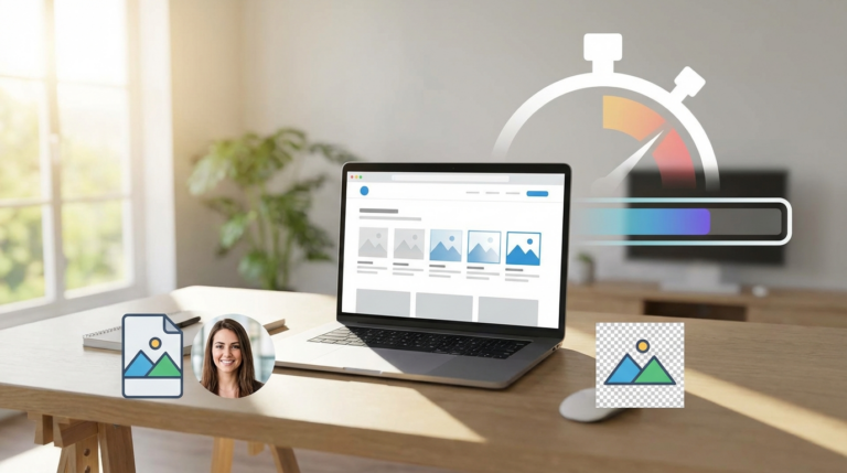
The visual consistency of these elements is also important. All product images should have a similar style and background. Using a free background remover can help you create clean, uniform thumbnails that make your grid look professional. Since images are the heaviest part of the page, you must ensure they load quickly. An online image compressor can reduce file sizes without sacrificing quality, which is important for a smooth browsing experience and better page speed optimization.
Which Filtering and Sorting Options Are Essential?
Filtering and sorting are the tools that allow users to take a large, unmanageable list of products and narrow it down to a small, relevant selection. Without effective options, users are forced to manually browse through potentially thousands of items, a task few will undertake. The key is to provide filters and sort types that align with how your customers think about your products.
Effective Filtering
Filters help users apply specific criteria to the product list. The most useful filters are category-specific. For example, a store selling laptops should offer filters for screen size, RAM, and processor type. A clothing store needs filters for size, color, and brand. Avoid generic filters that don’t help narrow choices meaningfully. It is also important that users can select multiple values for the same filter type (e.g., choosing both ‘Blue’ and ‘Green’ for color) and that applied filters are clearly displayed at the top of the list so they can be easily removed.
Smart Sorting
Sorting reorders the entire list based on a single attribute. While filtering removes items, sorting rearranges them. The default sort order is very important, as many users never change it. ‘Best Selling’ or ‘Featured’ are often better defaults than ‘Alphabetical’, which is rarely useful for product discovery. Important sorting options to include are:
- Price: Low to High
- Price: High to Low
- Newest Arrivals
- Customer Rating
Providing these standard options gives users control and helps them find products that fit their budget and preferences much faster.

How Should You Handle Product Loading and Pagination?
The method for loading new products as a user scrolls down the page directly impacts the browsing experience. The three main approaches are traditional pagination, a ‘Load More’ button, and infinite scrolling. Each has distinct advantages and disadvantages depending on the user’s goal.
Pagination, which uses numbered links (1, 2, 3…), gives users a clear sense of the catalog’s size and makes it easy to return to a specific page. It works well for users who want to methodically browse or remember where a specific item was located. A ‘Load More’ button is a good compromise, as it avoids reloading the entire page while still giving the user control over when new items appear. Infinite scrolling, which automatically loads products as the user scrolls, can create a more fluid experience but often makes it impossible to access the page footer or return to a previous position. For most e-commerce sites, a ‘Load More’ button offers the best balance of performance and user control.
Images makeup on average 50% of a web page’s total weight. How you load them directly impacts performance. — HTTP Archive
Personalization in Product Lists
Personalization adapts the product list to an individual user’s context and behavior, making the shopping experience feel more relevant. While complex, even simple forms of personalization can greatly improve usability. The goal is to use what you know about the user to highlight the most suitable products without being intrusive.
One powerful example is displaying compatibility notices. If a user has identified their car model on an auto parts site, product lists can show a badge on each item saying ‘Fits Your 2026 Honda Civic’. This saves the user from clicking into every product page to check compatibility. Another approach is to use browsing history to inform thumbnail selection. If a user previously viewed a specific color of a dress, that color can be shown as the default thumbnail in the list when they return. These small, context-aware adjustments reduce user effort and build confidence in their selections. Creating a detailed e-commerce photography style guide can help ensure you have the right image variations available for this kind of feature.
A high-performing product list is not achieved by accident. It requires a thoughtful combination of a clear layout, intuitive filtering, and helpful sorting options, all supported by fast-loading, high-quality visuals. If users cannot find what they want, they cannot buy it. Do this now: open one of your main category pages and try to find a specific product. Note every point of friction you encounter, from slow images to missing filters. This simple audit is the first step toward creating a browsing experience that converts.
FAQ
What is the difference between filtering and sorting?
Filtering narrows down a product list by removing items that don’t match selected criteria (e.g., showing only ‘red’ shirts). Sorting reorders the entire list based on a single attribute (e.g., arranging all products from ‘price low to high’).
How many products should be displayed by default on a category page?
There is no single magic number, but a good starting point is between 20 and 60 products. This provides enough choice to be engaging without overwhelming the user or slowing down the page load time excessively.
Is a grid view or list view better for mobile users?
A single-column grid view is often best for mobile. It prioritizes large, tappable images while still allowing for essential product information to be displayed vertically, fitting well on narrow screens.
Why is ‘alphabetical’ a bad default sort option?
Alphabetical sorting is rarely useful because product names seldom correlate with user priorities like price, popularity, or relevance. It often feels random and forces users to immediately select a different, more helpful sorting method.
Compress images without losing quality