
Visual design principles in UX (Friction Audit), 2026
5 principles of visual design in ux are scale, visual hierarchy, balance, contrast, and Gestalt. Used together, they reduce cognitive load and make interfaces easier to scan, understand, and act on. You can treat them as a “friction audit” checklist to find visual debt that quietly lowers task success and conversion.
Imagine this scenario: your landing page copy is solid, your offer is clear, and the traffic is qualified—yet users keep missing the primary call to action. You tweak button colors, swap headlines, and move sections around, but the drop-off barely changes. That’s a visual-design problem, not a messaging problem: the page doesn’t tell the eye what matters first.
A useful way to fix it is to stop debating taste and start diagnosing friction. The five principles below work best as an interacting system—contrast creates hierarchy, scale reinforces dominance, spacing enables grouping, and balance keeps attention from “falling off” the layout. You’ll audit what’s on the screen, decide what to keep, and justify changes with objective UX logic.
What are the 5 principles of visual design in UX?
The five principles are scale, visual hierarchy, balance, contrast, and Gestalt grouping. Together, they control attention, comprehension, and error rates by shaping what users notice, in what order, and what they believe belongs together.
Start by thinking like a diagnostician: every pixel is either helping the user complete a task or adding visual debt. When teams treat these principles as separate silos, they often “fix” one issue by creating another—like increasing contrast everywhere and ending up with a page that screams. Instead, run a quick friction audit that maps each principle to a concrete failure mode and a practical fix.
Use this friction-audit matrix to spot the problem before you touch a design file:
| Principle | What it controls | Common friction symptom | Fast diagnostic |
|---|---|---|---|
| Scale | Perceived importance | Key action feels optional | Compare headline, CTA, and form-field sizes |
| Visual hierarchy | Reading/scanning order | Users “hunt” for where to start | Do a 3‑second glance test: what do you recall? |
| Balance | Stability of attention | One side feels heavy or empty | Squint test for dominant blobs and voids |
| Contrast | Difference and meaning | Everything looks equally important | Count how many “high emphasis” styles exist |
| Gestalt | Grouping and relationships | Users mis-associate labels and fields | Check proximity, alignment, and common regions |
Checklist for a first-pass audit (10 minutes, no redesign required):
- Identify one primary task per screen and name the single “moment of commitment” (click, submit, add to cart).
- Mark the top three elements users must notice in order, then verify the layout enforces that order.
- Check text contrast against WCAG 2.1: body text needs at least a 4.5:1 ratio.
- Scan for grouping errors: labels too far from fields, unrelated items too close, inconsistent alignment.
- Count sizes and weights: if you have many competing scales, users will parse instead of act.
If you want a deeper companion read focused on attention order, use this breakdown of visual hierarchy in UX.
How does visual hierarchy guide user attention?
Visual hierarchy guides the eye so users encounter elements in a predictable order of importance. When hierarchy is clear, users don’t waste effort deciding where to look, so they make decisions faster and with fewer mistakes.
Hierarchy is built from a stack of signals—size, weight, color, spacing, placement, imagery, and repetition. You don’t need all of them; you need a consistent set that supports the page’s information architecture. The simplest way to justify placement is scanning behavior: many text-heavy pages follow an F-shaped pattern, while simpler promotional layouts often support a Z-pattern. Use those patterns as constraints, not rules: put the “start here” element where the first fixation is likely to land, and keep supporting details on the natural scan path.
This shows up clearly in form-heavy apps: when the primary input is visually anchored, task completion often improves because users stop hunting. You can see the idea in familiar interfaces: ride-hailing screens tend to prioritize the destination field, maps share attention with input controls, and secondary options are visually quieter. When teams ignore hierarchy, the UI can become a wall of similar rows—users then rely on slow reading and repeated backtracking.
Use this mini-audit to validate hierarchy without user testing:
- Do a “3-second recall”: glance at the screen for three seconds, look away, and write the first three things you remember.
- Run the “squint test”: blur your eyes until text becomes blocks; you should still see one dominant focal area and a clear secondary path.
- Trace the scan path: draw arrows from the dominant element to the next two steps a user should take.
- Check consistency: headings, subheadings, body, and UI labels should reuse the same 2–3 scale levels.
If you need to anchor hierarchy in real production constraints, think in tokens: every extra emphasis style (a new button color, a new badge shape, a new font size) spends attention budget. Spend it only on what changes decisions. For marketing pages, a practical add-on is a quick “dominance map” for each section: one dominant element, one supporting element, then readable body. If you work on conversion pages often, this companion method for visual hierarchy for marketing using the squint test gives a repeatable way to defend choices in reviews.

Why is scale critical for establishing information priority?
Scale uses relative size to signal importance and rank in a composition. If everything is the same size, users can’t infer priority, so they compensate by reading more than they should.
Scale works best when it’s intentionally limited. As a rule of thumb, a visually calm interface often stays within three main size steps for typography and key components: small, medium, and large. You’re not chasing minimalism; you’re preventing a “priority tie” where multiple elements look equally important. On a landing page, that tie often shows up as a headline that competes with a hero image, a CTA that looks like a secondary link, and a form that feels like an afterthought.
Make scale defensible by implementing it with consistent units and constraints, not ad hoc resizing. In CSS, prefer rem for type and spacing so the design scales with user settings, and set a clear type scale that maps to your hierarchy (headline, section title, body, caption). If you also work with product imagery, scale choices don’t stop at UI components. A product photo that’s too small relative to price and CTA can reduce confidence, while an oversized image with weak supporting text can hide shipping, returns, or key specs.
Practical scale rules you can apply today:
- Limit typography to 2–3 sizes per screen for body-level content, plus one display size for the headline if needed.
- Make the primary action the largest interactive target in its local area, not necessarily on the whole page.
- Use white space as “invisible scale” to separate primary from secondary content without shouting.
- Keep icon sizes consistent within a set; use position or color for state before resizing icons.
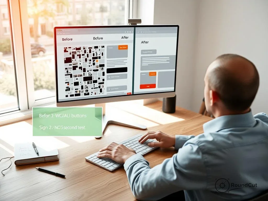
Example workflow: you’re preparing product thumbnails for a category grid. If backgrounds vary wildly, users perceive inconsistent scale and importance even when the images share the same pixel dimensions. A quick fix is to normalize the subject silhouette by removing distracting backgrounds, then re-crop to a consistent framing. A free background remover can help you standardize visual weight across images so your UI scale decisions aren’t fighting messy photography. If you also need strict framing for different placements, a free crop image tool with custom aspect ratios can keep your hero, card, and thumbnail variants aligned to the same scale logic.
How to apply balance and contrast for better readability?
Balance is the satisfying distribution of visual weight across a layout; contrast is the deliberate difference between elements to communicate meaning. When you tune them together, users read with less strain and make fewer wrong clicks.
Balance is easiest to diagnose when you stop thinking in “elements” and start thinking in “mass.” A single large image can outweigh five small text blocks; a bright button can outweigh an entire column of gray copy. Use the squint test to see the page as blobs, then ask if the blobs support the intended path: dominant area first, then supporting information, then optional content. If you have a two-column layout, check whether one side feels like it’s pulling attention away from the task, especially near conversion points.
Contrast is where many teams create accidental friction. They increase contrast everywhere to “make it pop,” then end up with multiple competing focal points. In digital UX, contrast must also respect accessibility. WCAG 2.1 sets a widely used baseline: body text needs a contrast ratio of at least 4.5:1. Don’t treat that as a compliance checkbox; treat it as a readability floor that protects real users in bright light, low-quality displays, or reduced vision.
“The visual presentation of text and images of text has a contrast ratio of at least 4.5:1.” — W3C, Web Content Accessibility Guidelines (WCAG) 2.1
Use this balance-and-contrast checklist before you ship:
- Reserve high-contrast colors for actions and states that change behavior (primary CTA, destructive action, system alerts).
- Keep secondary text readable; don’t lower contrast so far that it becomes “decorative” text.
- Ensure interactive elements differ from plain text by more than color alone (shape, underline, or a container helps).
- Verify contrast with an official reference: WCAG 2.1 contrast (minimum).
- Rebalance sections by adjusting white space and alignment before adding new colors.
For a performance constraint that affects readability in 2026, image weight matters: oversized images can delay rendering, shift layout, and disrupt scanning flow. If your hero image loads late, the hierarchy you designed won’t exist for the first seconds of the visit. An online image compressor can reduce file size so content appears sooner, supporting the hierarchy you intended. If you want a technical companion focused on layout stability and image loading strategy, this is a practical follow-up on responsive images and LCP fixes.
Which Gestalt principles are most important for UI design?
Gestalt grouping principles explain how people organize many visual parts into meaningful wholes. In UI design, the most consequential are proximity, similarity, common region, and figure/ground because they shape what users believe belongs together.
You don’t need to memorize the full psychology catalog to use it well; you need to prevent predictable grouping errors. Proximity is the classic one: labels must sit closer to their input than to the next input, and related controls must cluster with consistent spacing. Similarity is just as powerful: if a link looks like a button, users expect button behavior; if a secondary action matches the primary action’s styling, users will click the wrong one. Common region is your friend when screens get dense—cards, panels, and subtle containers can declare grouping without increasing contrast everywhere.
For a quick external anchor on the concept (and a useful page to share with stakeholders who want “the science”), link to the plain-language overview of Gestalt principles of perception. Treat it as an explanation for why grouping works, not as design permission to add decorative containers. The goal is usability: lower cognitive load, fewer misclicks, and faster completion.
UI-critical Gestalt checks (use them in design reviews):
- Proximity: related items sit closer together than unrelated ones; spacing changes only at group boundaries.
- Similarity: same visual treatment means the same function; avoid styling two different behaviors identically.
- Common region: cards and panels group content; keep padding consistent so the container feels intentional.
- Figure/ground: the primary task stands out from the background; avoid busy textures behind text.
- Continuation: align items so the eye can follow a predictable path across a form or table.
Concrete examples you can reference in team discussions: onboarding and signup flows often succeed when proximity is strict—field labels, helper text, and validation messages must read as one unit. When proximity fails, users attach errors to the wrong field and get stuck. For brand and marketing pages, similarity and figure/ground shape trust: if a “secure checkout” badge looks like a button, users click it, feel blocked, and lose confidence. When you tie these checks back to the earlier principles, you get a coherent system: Gestalt grouping clarifies relationships, contrast marks differences, and hierarchy sets the order of attention.
How do you run a friction audit on an existing landing page using the 5 principles of visual design in UX?
A friction audit is a structured walkthrough that turns subjective design feedback into specific, testable changes. Run it by mapping each screen area to the five principles, then fixing the highest-impact bottleneck first.
This problem comes up in reviews all the time: ten people give ten conflicting opinions—“make the logo bigger,” “add a gradient,” “move the testimonials up.” A friction audit replaces that noise with a shared rubric. You’ll define the page’s conversion moment, trace the intended scan path, and check whether the design supports it. The result surprises many teams that adopt it: the best fixes are often white space, emphasis discipline, and clearer grouping, not new visual flair.
Use this step-by-step audit flow (aim for 30–45 minutes):
- Define the single goal: the exact action you want (start trial, request quote, add to cart).
- Mark the attention order: three elements users must see in sequence; validate with an F vs Z scan assumption.
- Run the squint test: verify one dominant block per section; rebalance white space before changing colors.
- Check WCAG contrast: confirm 4.5:1 for body text and fix the worst offenders first.
- Inspect Gestalt grouping: look for label-field separation, inconsistent card padding, and mixed alignment.
- Apply scale constraints: reduce competing sizes; enforce a type scale with rem so it remains consistent.
- Write “because” statements: every change gets a one-line rationale tied to a principle.
Make your recommendations hard to dismiss by using “because” language that connects principles instead of treating them independently. Example: “Increase CTA contrast and size because contrast creates hierarchy, and scale reinforces priority at the moment of commitment.” Or: “Add a common region around pricing tiers because proximity alone isn’t enough to prevent plan-feature confusion.” As a disqualifier for the approach, skip a full friction audit when the page’s core message is wrong or the product-market fit is unclear; you’ll polish the wrong thing. In that case, do a lightweight hierarchy pass only—fix glaring contrast failures and grouping errors—then return to messaging tests.
“Attractive things work better.” — Don Norman, author and design researcher
If you need to tie UX principles back to image workflow in a practical way, treat product photography as part of the interface: inconsistent backgrounds, mismatched framing, and oversized files all create friction that your UI can’t fully compensate for. Improve the source images first, then let the interface principles do their job.
When you write up your recommendations, keep the language concrete and stakeholder-friendly. Frame the rubric as the principles of visual design, then point to the specific visual design elements and principles you changed (type, color, alignment, proximity, repetition, and white space). When grouping is the issue, name the gestalt principles visual design behind the fix (proximity, similarity, common region, figure/ground). Include a short set of principles of design examples in your rationale: “Changed X because it clarifies hierarchy,” “Reduced Y because it creates balance,” “Adjusted Z because it prevents mis-association.”
Recommended next action: pick one high-traffic landing page, run the audit once, and ship only the top three fixes that remove the biggest attention bottleneck. Don’t redesign the page; measure whether users reach the commitment moment faster and with fewer misclicks.
What’s the fastest way to check if a page has a hierarchy problem?
Do a 3-second recall and a squint test. If you can’t name the page’s primary action and the next step after a quick glance, the hierarchy isn’t doing its job.
Do F-pattern and Z-pattern scanning apply to mobile screens?
They’re less rigid on mobile because screens are narrow and layouts stack vertically. The principle still holds: users look for a clear starting point and a predictable path, so place the primary decision early and keep supporting content grouped and readable.
Is 4.5:1 contrast always required?
WCAG 2.1 sets 4.5:1 as the minimum for normal body text. Larger text can have different thresholds, and brand constraints may push you toward alternatives like stronger font weight, larger size, or improved background separation.
How many font sizes should a typical UI screen use?
A good target is 2–3 sizes for most screens, plus a single display size for a hero headline when the layout supports it. More sizes can work, but they need stricter rules so you don’t create competing priorities.
What’s one sign Gestalt grouping is causing real errors?
Users mis-associate labels, helper text, or validation messages with the wrong field. If people hesitate mid-form or fix “errors” in the wrong place, proximity and common region usually need attention.
Use the five principles—scale, visual hierarchy, balance, contrast, and Gestalt—as one system: set a clear attention order, limit your scale steps, keep contrast meaningful and accessible, and tighten grouping with proximity and common regions. Pick one screen, run the friction audit, and ship the top three changes with a one-line “because” rationale for each.
If your next step is learn to craft effective prompts for ai. this guide covers key elements like role, context, constraints, and a framework for testing your prompts, How to Craft Effective Prompts: A Guide for AI Users is a dedicated option for that workflow.
FAQ
What’s the fastest way to check if a page has a hierarchy problem?
Use a 3-second recall and a squint test. If you can’t name the primary action and the next step after a quick glance, the hierarchy needs work.
Do F-pattern and Z-pattern scanning apply to mobile screens?
They’re less rigid on mobile because layouts stack vertically. The idea still applies: put the primary decision early and keep supporting content grouped on a predictable path.
Is 4.5:1 contrast always required?
WCAG 2.1 sets 4.5:1 as the minimum for normal body text. Larger text can use different thresholds, and you can also improve readability with size, weight, and background separation.
How many font sizes should a typical UI screen use?
Aim for 2–3 sizes for most screens, plus one display size when the layout supports a hero headline. More sizes can work if you apply strict rules to avoid competing priorities.
What’s one sign Gestalt grouping is causing real errors?
People attach labels, helper text, or validation messages to the wrong field. That usually points to proximity or common region issues.
Remove image backgrounds for free