
Visual Hierarchy for Marketing (Squint Test) 2026
Visual hierarchy for marketing is the deliberate structural ordering of text, images, and layout elements to ensure your audience identifies the most critical information first—typically the core offer and the immediate call to action—within a split-second window. This system works by manipulating visual weight through size, contrast, positioning, and whitespace, effectively directing the eye along a curated path instead of allowing it to drift aimlessly. Unless you consciously design for this flow, your message risks being lost in the noise of a crowded feed.
You likely recognize the scenario: a promotional graphic goes live, site traffic sees a measurable uptick, yet the conversion rate remains stagnant. Or perhaps you launch an email campaign where the hero image is aesthetically pleasing, but the actual discount code is overlooked. In most instances, the failure isn’t the underlying idea; rather, the layout didn’t provide a clear roadmap for the viewer’s attention. Besides, attention is a finite resource. If every element—headline, logo, product photo, and button—shouts at the same volume, the viewer won’t exert the effort to “choose correctly.” They will simply scan, experience cognitive load, and move on.
Think of visual hierarchy not as subjective art theory, but as a rigid set of mechanical rules designed to maximize communication efficiency. It is the scaffolding that holds your marketing message together, ensuring that the “hook” lands before the details are even processed. By mastering these principles, you stop hoping people see your CTA and start guaranteeing they do.
What is visual hierarchy for marketing, and how does it influence marketing outcomes?
Visual hierarchy for marketing is the strategic arrangement of elements so viewers grasp the value proposition and the required next step at a glance. It directly influences outcomes by enhancing scannability, eliminating choice paralysis, and making the call to action (CTA) feel like the only logical conclusion to the visual story. When hierarchy is absent, even the most compelling copy remains unread because the entry point for the eye is cluttered.
To understand the mechanics: your brain doesn’t digest a marketing asset like a linear novel. Instead, it aggressively seeks “signals”—dominant shapes, high contrast, human faces, bold numerals, and vibrant colors—to construct meaning rapidly. If the first signal detected is a decorative border and the second is a secondary brand mark, you’ve squandered the viewer’s initial interest. This is why design principles such as focal points and color salience are pivotal; they determine what is retained versus what is ignored. Still, achieving this doesn’t require complex software. For instance, if you are designing a promotional avatar or a featured badge, using a simple circle image cropping tool can help centralize the subject and create an immediate, recognizable focal point.
The Three-Layer Framework for Attention
A reliable method for establishing hierarchy is to segment your content into three distinct layers, each with a specific functional role. Layer 1 is the Hook: it must win the first glance through a singular, dominant focal point like a massive headline or a hero product image. Layer 2 is the Meaning: this provides the necessary context or benefit, such as “50% off everything” or “No credit card required.” Layer 3 is the Action: this is the friction-reduction layer, containing the CTA and essential trust signals like a rating or a guarantee. Plus, you must ensure these layers don’t compete; if your Layer 2 text is the same size as your Layer 1 headline, the hierarchy collapses.
Measurable Rules for Non-Designers
If you are creating graphics without a dedicated design team, keep your rules quantitative. Your headline should maintain at least a 2:1 size ratio over body text to create clear dominance. Furthermore, your primary CTA should be the highest-contrast object on the s. If the background is a soft blue, a sharp orange button isn’t just a color choice—it’s a directional signpost. Also, consider the “Rule of Isolation”: give your most important element more whitespace than anything else. This forces the eye to acknowledge it because there is nothing nearby to distract from its presence.
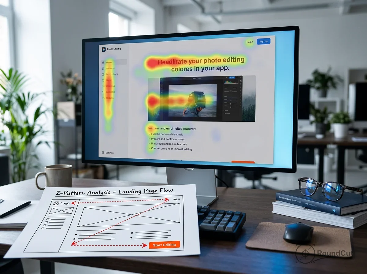
How do F-patterns and Z-patterns guide user attention?
F-patterns and Z-patterns are the default scanning trajectories people adopt when they aren’t committed to reading every word. By placing your hook and CTA along these natural paths, you align your design with human behavior instead of fighting against it. These aren’t arbitrary shapes; they represent the path of least resistance for the eyes. Yet, many marketers hide their most important info in low-attention “blind spots” like the bottom-left corner of a dense text block.
The F-pattern is common on text-heavy surfaces like blog posts or detailed landing pages. The eye sweeps horizontally across the top, moves down slightly for a shorter horizontal scan, and then skims vertically down the left side. Conversely, the Z-pattern is the standard for visual-first assets like hero banners or social media ads. The eye travels from top-left to top-right, cuts diagonally to the bottom-left, and finishes at the bottom-right. When planning a layout, decide which pattern fits your content density, then place your “confirmation glance” and “action glance” accordingly.
The Mobile Reality and Vertical Scanning
While F and Z patterns are foundational for desktop, mobile screens effectively compress these into a single vertical sequence. On mobile, hierarchy is largely determined by vertical order and size. You must place your CTA much earlier in the scroll than you would on a desktop site. Imagine a user scrolling through a LinkedIn feed; if your focal point isn’t immediately obvious, they won’t stop. For those optimizing profile presence, referencing LinkedIn profile photo dimensions is essential to prevent awkward automatic cropping that might displace your face—the natural focal point of any profile—from the center of the frame.
How can you create high-quality marketing visuals without outsourcing?
You can generate professional-grade visuals by adopting a repeatable layout recipe: one dominant focal point, a rigid type scale, a single accent color, and strict spacing. Since consistency usually beats complexity in high-volume marketing, mastering a few core templates is more effective than starting from scratch every time. Start with constraints that protect clarity. For example, choose one font family and commit to just three sizes: headline, sub-headline, and fine print. This prevents the “visual clutter” that occurs when too many styles compete for attention.
Imagery management is another area where you can save time. If your background is visually noisy, your text will struggle for legibility regardless of its size. A highly effective workaround is to isolate your subject. If you have a product shot with a messy warehouse background, using a free background remover allows you to place that product on a clean, solid color. This instantly creates a high-contrast focal point. Then, if the dimensions don’t fit your platform, you might use a partner tool for custom aspect ratio cropping to ensure the subject remains balanced within the new frame.
The DIY Production Workflow
Follow this five-step sequence for every asset: First, define your s size (e.g., 1080×1080 for Instagram). Second, place your subject using the rule of thirds to avoid static, dead-center compositions. Third, set your type scale (Headline ≈ 2x Body). Fourth, apply one accent color exclusively to the CTA. Finally, lock your margins. Even though it might feel restrictive, these boundaries prevent the “everything is important” trap that ruins most DIY designs. Though you might be tempted to add icons or shadows, remember that every extra element potentially dilutes the primary message.
What are the 5 essential tips for mastering visual hierarchy?
Mastering hierarchy is less about artistic talent and more about disciplined execution of these five principles. If you can implement these, your layouts will communicate faster than your copy alone. Plus, they work regardless of the platform—from a printed flyer to a TikTok overlay.
- Protect the Focal Point: You cannot have three primary focal points. If the face is the hero, the headline must be secondary. If the discount is the hero, the image must support it, not compete with it.
- Control Weight with Contrast: Before adding bold fonts, try changing the color. A small, bright button often has more “visual weight” than a large, dull one.
- Leverage Negative Space: Whitespace isn’t “empty”; it’s a structural tool. It acts like a buffer that prevents the eye from getting distracted by neighboring elements.
- Align to Scanning Paths: Don’t place your CTA in a corner that the eye never visits. Use the F or Z patterns to ensure the “Action Glance” lands right on the button.
- Design for Tap Targets: On mobile, hierarchy is also about ergonomics. A button that is too small or too close to a link is a failure of hierarchy because it creates physical friction.
Unless you are a specialist, avoid “eyeballing” your layouts. Use a grid. Alignment creates a sense of order that makes hierarchy easier to process. When elements are misaligned, the brain spends energy trying to make sense of the mess instead of absorbing the offer. Also, if you find your images look soft or take too long to load—which can disrupt the user experience—running them through an image compressor ensures they stay crisp and fast without losing their hierarchical impact.
Visual Weight Comparison Table
| Factor | Primary Function | Common Mistake | Pro Tip |
|---|---|---|---|
| Size | Instant Priority | Making everything big | Only one “largest” element allowed |
| Contrast | CTA Direction | Low-contrast text on images | Use 4.5:1 ratio minimum |
| Space | Comprehension | Cramming text to the edges | Leave a 10% margin buffer |
| Position | Scanning Match | Placing CTA in “dead zones” | Follow the Z-pattern diagonal |

How do you run the “Squint Test” audit on your marketing visuals in under 3 seconds?
The Squint Test is a remarkably effective, low-tech audit to verify your hierarchy. By blurring your vision or zooming out until the text is unreadable, you reveal the underlying “skeleton” of your design. If your CTA isn’t one of the first three things you notice in this blurred state, your hierarchy is failing. You are testing communication speed, not aesthetic beauty. Because during a fast scroll, users are effectively performing a high-speed squint test on every post they see.
Imagine you’ve just finished a promotional banner for a flash sale. Squint at it. Do you see the product? Do you see the “50% OFF”? Do you see the “Shop Now” button? If you only see a generic block of color, you need to increase the contrast or size of those three pillars. This framework is especially useful for maintaining visual branding consistency because it forces you to rely on your brand’s core colors and shapes rather than fine details that might change between campaigns.
The 5-Point Squint Checklist
- Blur Check: What is the absolute first shape that catches the eye?
- 3-Second Message: Can you tell what is being sold without reading the sub-text?
- Target Search: Is the CTA button immediate, or do you have to “look” for it?
- Brand Vibe: Even blurred, do the colors feel like your business?
- Platform Crop: Will the focal point survive if the edges are cut off by an app?
How can you test whether your visuals are on-brand without slowing down production?
Testing for brand alignment shouldn’t be a bottleneck. Instead, check for repeatable signals: your specific palette, type scale, and image style. If one post uses center-aligned text and the next is left-aligned with a completely different margin system, you are forcing your audience to re-learn your “visual language” every time. This friction destroys the trust that hierarchy is supposed to build. Use accessibility standards as a baseline; for example, the W3C minimum text contrast rules ensure your hierarchy works for everyone, including people viewing your ads on dim mobile screens in direct sunlight.
One final production check: verify your export path. A design might look perfect in your editor, yet it fails if the platform compresses it into a blurry mess. If you are moving assets between different systems, using a tool to convert format (like PNG to WebP) can help maintain quality while reducing file size. Furthermore, if you need more resolution for a high-impact hero image, an AI image upscaler can sharpen the details without requiring a total redesign. Then again, always preview the final result on a real device. What looks balanced on a 27-inch monitor often feels cluttered on a 6-inch phone screen.
Visual hierarchy for marketing is your most powerful tool for cutting through digital noise. By defining a singular focal point, maximizing CTA contrast, and respecting the natural scanning patterns of your audience, you transform passive viewers into active participants. Remember to run the Squint Test on every asset, prioritize mobile scannability, and maintain rigid consistency in your typography and spacing. When your visuals have a clear order, your message becomes impossible to ignore. Start by fixing just one asset today—re-evaluate your last post, adjust the headline scale, and see how much faster the message lands.
If your next step is a practical guide to create a photo collage online for free. follow 5 steps from choosing a layout to downloading a high-quality jpeg or png, How to Create a Photo Collage Online for Free (Simple Guide) is a dedicated option for that workflow.
FAQ
Is visual hierarchy only for websites, or does it apply to social media posts too?
It applies to every surface where eyes scan, including social posts, ads, and emails. In fact, hierarchy is even more critical on social media because scanning speeds are significantly faster, meaning your focal point must be unmistakable within a second.
What’s a good CTA size rule if I’m not a designer?
Focus on contrast and isolation rather than just raw size. Make the CTA the highest-contrast element on the page and surround it with generous whitespace (negative space) so it doesn’t compete with nearby text or images.
Should I put my logo at the top-left every time because of scanning patterns?
Not necessarily. While the top-left is a high-attention area, you should prioritize your value proposition (the offer) there. If your brand colors and typography are consistent, the logo can occupy a secondary, quieter position like the bottom-right.
What’s the fastest way to choose between an F layout and a Z layout?
Use an F-pattern for content-heavy assets like articles or pricing lists where users need to scan text. Use a Z-pattern for visual-heavy assets like hero banners or simple ads where you want to lead the eye from a headline to a button.
How do I keep visuals consistent when multiple people create them?
Implement a ‘Brand Checklist’ that defines specific constraints: one font family, a fixed 2:1 headline-to-body ratio, and a single accent color for all CTAs. Standardizing these rules prevents ‘creative drift’ and keeps the hierarchy predictable.
Remove image backgrounds for free