Visual Hierarchy UX: 6 Design Principles (2026 Tested)
Visual hierarchy principles help you control what someone notices first on a fast scroll—so the headline, product, and CTA land in the right order instead of competing. By using size, color contrast, typography scale, and negative space, you guide your eye through a clear path that reduces effort and supports clicks, signups, or purchases.
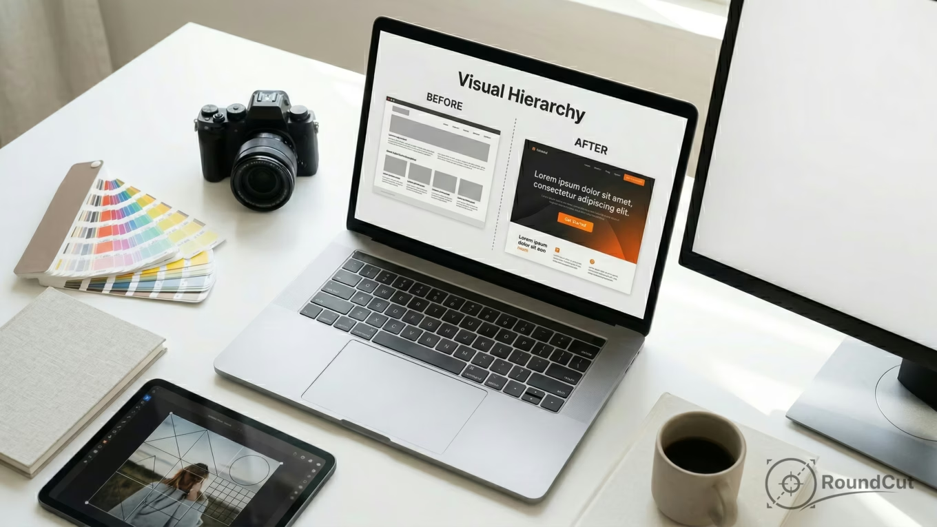
You’ve spent hours perfecting a social media banner for your new product launch. The colors are vibrant, the photography is sharp, and you’ve included every detail about the features. Yet, after launching the campaign, the engagement data looks dismal. Users scroll right past your post, or they click the image but miss the “Buy Now” button entirely. This isn’t a failure of your product; it’s a failure of visual organization. When every element on the screen yells for attention at the same volume, the user hears only noise. Instead of processing your offer, their brain chooses the easiest path: ignoring the post.
Think of it this way: your design is a conversation with a friend. If you shout ten different things at once, they won’t understand any of them. Successful design needs a clear “voice” that tells the reader where to start and what to do next. People don’t read screens like books; they scan them. When you apply a deliberate structure, you turn a chaotic layout into a high-conversion tool for mobile and web platforms alike.
What is visual hierarchy and why is it critical for UX?
Visual hierarchy is the arrangement and presentation of elements in a way that implies relative importance. In user experience, it acts like an invisible guide that leads a visitor through your content. Without it, a layout feels like a “junk drawer” of information, forcing the user to do the heavy lifting of figuring out what matters. These visual hierarchy principles aren’t just about aesthetics; they support functionality and cognitive efficiency. When you establish a clear order, you lower the friction for your message.
Every pixel on your screen has a priority level. If you’re designing a mobile app, the primary action—maybe a “Check Out” button—needs the highest priority. Secondary information, like shipping details or product descriptions, should sit lower on the ladder. This concept is often called “pixel priority,” and it’s part of visual hierarchy theory. When you ignore this ladder, you create design debt: small, confusing choices that add up until the interface feels hard to use. Strong layouts respect limited attention by making the path of least resistance the one you want the user to take.
- Reduces cognitive load: users don’t have to guess where to click; the design signals it.
- Increases conversion: when the CTA is the focal point, the next step feels obvious.
- Improves accessibility: a clear structure helps users with low vision or cognitive differences navigate more easily.
- Builds brand trust: tidy, consistent layouts feel more reliable than cluttered ones.
Your job as a designer (or as a business owner making your own graphics) is to be a visual editor. Decide what the single most important message is, then make sure nothing else competes with it. This matters even more for key principles of visual hierarchy in ux design, where the goal is often speed and clarity. If a user has to squint or hunt for a button, you’ve already lost them. A disciplined approach to placement helps your design work immediately when it hits the screen.
What are the 7 core principles of visual hierarchy?
To control the flow of information, you need to understand the levers that change an element’s visual weight. Visual weight is how strongly an element pulls attention. A large, bright red circle has more weight than a small, gray square. When you balance these weights, you create a path for the eye to follow. These seven principles work together across everything from a complex web dashboard to a simple Instagram ad.
Size and scale are the most obvious tools. In general, the larger an item is, the more important it feels—but size is always relative. A medium headline only looks big if the body text around it is smaller. Color and contrast are equally powerful. High contrast—like black text on a white background—demands attention, while low contrast fades into the background. You can also use the technical CSS z-index concept to think about depth: elements that overlap or appear closer tend to feel more important. Layering can create a sense of importance even on a flat screen.
| Principle | How It Works | Common Application |
|---|---|---|
| Size | Big gets noticed first; small is perceived as secondary. | Main headlines (H1) vs. subheadlines (H2). |
| Color | Bright, saturated hues attract more attention than neutrals. | Using a vibrant color for a “Buy Now” button. |
| Contrast | Difference in value or color makes elements stand out. | Dark text on light backgrounds for readability. |
| Typography | Heavier weights and distinct styles signal importance. | Emphasizing key phrases for skimming. |
| Whitespace | Negative space isolates elements and gives them breathing room. | Adding padding around a logo to make it stand out. |
| Proximity | Items placed close together feel related. | Grouping an image with its specific caption. |
| Alignment | Consistent placement creates order and builds trust. | Aligning text to a grid for a professional look. |
Whitespace (negative space) is one of the most useful tools in high-end design. Many non-designers feel the urge to fill every empty corner with more information and treat whitespace as wasted space. Think of whitespace as the silence between musical notes: it gives the message room to land. Negative space lets the eye rest and helps your CTA or product become the clear focal point without needing to make it bigger or louder. For social media and mobile-first visuals, this matters because the screen is small and competition is intense; you often win by removing distractions, not by adding more.
How do scanning patterns (F and Z) dictate user attention?
People rarely read web pages word-for-word. Instead, they scan in predictable patterns based on reading direction and how dense the content feels. When you understand scanning patterns, you can place your key message where the eye is likely to land first. The two most common patterns are the F-pattern and the Z-pattern, and they show up everywhere from landing pages to social posts. Choosing the right one depends on how much text you’re presenting and how your layout is composed.
The F-pattern is common for text-heavy pages like blog posts or news articles. Users start at the top-left, read across the top, then move down the left side, occasionally scanning horizontally again but for shorter distances. This creates a shape that resembles the letter “F.” For a long guide, your most vital information belongs in the first two paragraphs or the first few words of each bullet point. The Z-pattern fits more visual layouts with less text, like landing pages and many social media banners. The eye moves from top-left to top-right, diagonally down to the lower-left, and finishes at the lower-right.
| Layout pattern | Best for | Where to place the focal point | Typical formats |
|---|---|---|---|
| F-pattern | Dense text and scanning for facts | Top-left headline, then strong left-side subheads and bullets | Blog posts, long landing pages, product detail pages |
| Z-pattern | Fast comprehension with minimal text | Top-left hook, top-right brand cue, bottom-right CTA | Social ads, hero banners, simple landing pages |
Consider the difference between an Amazon-style search results page and a sleek Apple product landing page. A results page usually follows an F-pattern because it’s dense with information, while an Apple-style page often uses a Z-pattern to lead you through a small number of strong visuals. You can also use tools like a free crop tool to size images for these patterns, keeping key subjects in the “hot zones” where the eye tends to land. If the subject is cropped off-center or pushed into a dead zone, the hierarchy breaks and the CTA competes with the wrong things.
“Design is the conscious effort to impose a meaningful order.” — Victor Papanek, designer and author of Design for the Real World
On mobile-first layouts, scanning becomes even more compressed. The thumb zone near the bottom of the screen often becomes the most practical area for interaction, which can shift your hierarchy away from desktop expectations. This is part of visual hierarchy in marketing: you’re not just designing for visibility, you’re designing for reach. If your CTA sits at the very top-right of a large phone, it may be visible but awkward to tap, creating friction that hurts performance.
How to use color and contrast to establish a clear focal point?
Color is one of the fastest ways to signal importance. Your brain spots color differences quickly, especially when they suggest urgency or action. In your designs, you can use accent colors to create a focal point—the one place the eye lands first. If your layout uses mostly blue and gray, a single orange button gains visual weight. This is a core part of how to create visual hierarchy when you’re competing for attention on a feed.
Contrast isn’t only about hue; it’s also about lightness (value) and saturation. A common mistake is using colors that are too similar in value, which makes text hard to read and buttons hard to see (for example, light gray text on a white background). To fix this, you can use a free background remover to isolate a product from a busy photo so you can place it against a clean, high-contrast background. That removes competing visual noise and makes the product the clear hero of the frame.
- The 60-30-10 rule: use a dominant color for 60% of the design, a secondary for 30%, and an accent for 10% (often the CTA).
- Accessibility: check that text-to-background contrast meets web standards (a common baseline is 4.5:1 for normal text).
- Color psychology: warm colors (red, orange) draw attention; cool colors (blue, green) work well for backgrounds and secondary elements.
- Avoid overload: if you use five different “accent” colors, nothing feels like the action color; keep actions to one, maybe two.
- Saturation: more saturated colors tend to feel heavier than muted tones.
Contrast is the volume knob of your design. High contrast is a shout; low contrast is a whisper. If you want people to notice the offer, use high contrast for the offer elements. If you need a disclaimer that shouldn’t compete with the CTA, lower its contrast and reduce its size so it stays readable without becoming the focal point. For practical overlay guidance, these tips for adding text to images cover readability on complex photography.
What are real-world visual hierarchy examples in social media marketing?
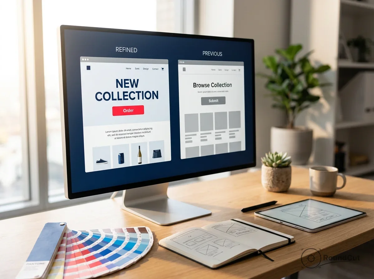
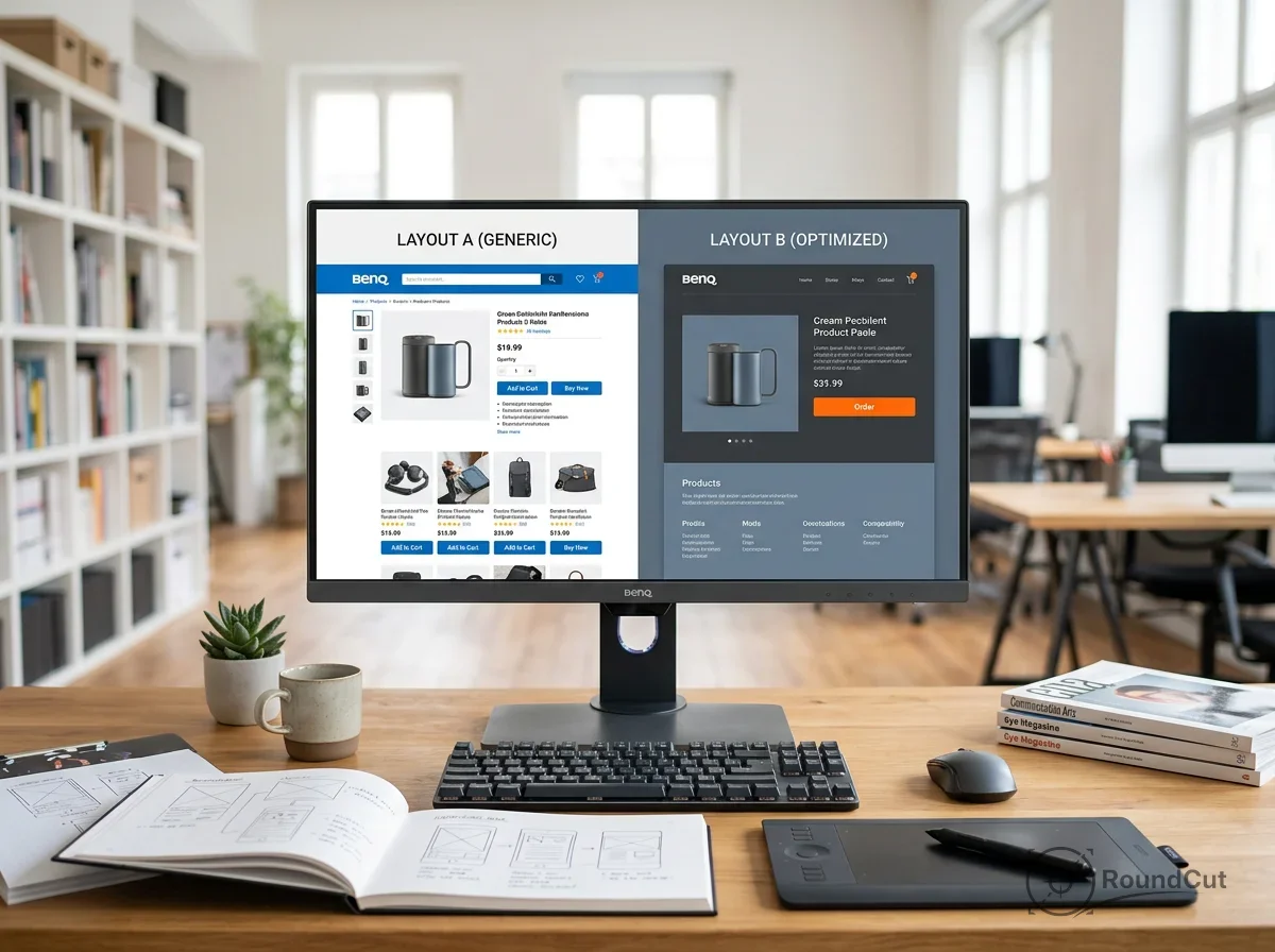
Social media is the most unforgiving test of visual hierarchy principles. On platforms like Instagram, X, or LinkedIn, you have a split second to stop a scroll. Marketing visuals have to be clear at a glance and decisive about what matters first. A common visual hierarchy examples format is the hero layout: one strong product image (the hero), a bold benefit-led headline, and a single clear CTA. Secondary paragraphs and fine print don’t belong in the first view on mobile; the first screen should sell the next action.
Look at a typical before-and-after ad for a skincare product. The “After” photo is often larger, brighter, and placed toward the right side (where a Z-pattern ends), signaling progress. The price or “Shop Now” button tends to appear in a contrasting color near the bottom so the eye can complete the path. Another example is profile-photo hierarchy: on professional networks, your avatar becomes the focal point. Using a free image compressor can help your headshot load quickly, which prevents layout jumps that break your hierarchy. If the photo takes a few seconds to load on mobile, your CTA and headline may get ignored while the page feels unstable.
For a professional baseline, the Apple Human Interface Guidelines emphasize clarity and deference to content. Even if you aren’t designing an iPhone app, the principle carries over to marketing graphics: the content (your product and offer) should be the star, and the UI elements (text, badges, buttons) should support it. For platform-specific cropping and composition, LinkedIn profile photo dimensions can help you avoid accidental cuts that move the focal point out of the hot zone.
How to audit your design for visual weight and flow?
Once you’ve finished a design, you need to verify that it works for someone who doesn’t already know where to look. A simple check is the squint test: narrow your eyes until the design blurs. You should still be able to pick out the headline and the CTA as the strongest shapes. If everything blends together, increase contrast, spacing, or size differences. This quick audit lets you apply visual hierarchy principles without eye-tracking software.
Another check is a visual weight checklist. Go through each element and assign it a priority from 1 to 5, with only one element allowed at Priority 1. If you label three items as top priority, you’re creating a conflict that forces the user to decide. Also check alignment and proximity: misaligned elements create visual friction, and separated related items make the eye work too hard. A simple grid helps different-sized elements feel intentional and consistent.
- The 5-second test: show the design for five seconds, then hide it; ask what the person remembers. If they can’t name the main offer, the hierarchy didn’t land.
- Rule of thirds: place the focal point near a 3×3 grid intersection for a more dynamic composition.
- Proximity check: keep the “Buy” button close to the price so the eye doesn’t have to jump to connect them.
- Scanning check: trace the path—headline → image → CTA—and confirm it feels automatic on mobile.
- Mobile reality: shrink the s; if the headline fills the whole screen, reduce scale or tighten the copy so the CTA remains visible.
Use this scoring rubric to make the audit concrete (it’s a tool for decision-making, not a universal rule):
- Size (1–5): 1 = microcopy, 3 = secondary label, 5 = headline/CTA.
- Color contrast (1–5): 1 = low-contrast helper text, 3 = normal body contrast, 5 = CTA contrast that stands out at a glance.
- Texture/detail (1–5): 1 = flat solid shape, 3 = subtle gradient or light grain, 5 = high-detail photo or pattern (use sparingly so it doesn’t steal focus).
- Negative space (1–5): 1 = crowded edges, 3 = comfortable padding, 5 = generous isolation around the CTA/product.
When you need the product to hold attention, use negative space as a frame: increase padding around the product, reduce competing details near the edges, and keep the CTA on a clean background so the eye doesn’t get pulled away. This helps the product feel like the visual anchor and keeps the scan path steady from hook to action. With consistent practice, you’ll spot hierarchy problems before they reach your customers.
What is the most important principle of visual hierarchy?
All principles work together, but size often has the strongest first impression because it’s the fastest signal of importance. Size only works when it’s supported by contrast and spacing; a large element that blends into the background still gets ignored.
Can you have more than one focal point in a design?
You can have one primary focal point and a small number of secondary focal points, but they need clear separation in visual weight. If your “Learn More” link looks as heavy as your main CTA, you’re forcing the user to choose, which usually reduces action.
How does whitespace help visual hierarchy?
Whitespace (negative space) separates and isolates. When you add space around an element, you reduce competing noise and make the element easier to notice and understand. It also makes layouts feel calmer and more intentional.
What is the difference between F-pattern and Z-pattern scanning?
The F-pattern shows up on text-heavy pages: the eye scans across the top and then down the left side, picking up key subheads and bullets. The Z-pattern fits visual layouts with minimal text: the eye moves across the top, diagonally down, and ends near the bottom-right where a CTA often performs best.
How do I know if my visual hierarchy is working?
Use the squint test and confirm that the headline and CTA remain the strongest shapes when the design blurs. Then run a 5-second test with someone new to the offer and check whether they can describe the main message and next action from memory.
Start with the scan path you want on mobile: hook → product → CTA. Pick one Priority 1 element, give it size and contrast, and isolate it with negative space so nothing else competes. Run the squint test, then the 5-second test, and adjust alignment and proximity until the CTA is the easiest next step to take.
If your next step is canva vs photoshop: a detailed 2026 comparison for beginners and pros. learn which is better for social media graphics or professional photo editing, Canva vs Photoshop (2026): Which Design Tool is Best? is a dedicated option for that workflow.
FAQ
What is the most important principle of visual hierarchy?
Size often creates the strongest first impression because it’s an immediate signal of importance. It still needs contrast and spacing to work; otherwise, it blends in.
Can a design have more than one focal point?
Yes, but you need one primary focal point and clearly lighter secondary ones. If two elements feel equally heavy, the user hesitates and action drops.
How does whitespace improve visual hierarchy?
Whitespace (negative space) isolates important elements and reduces competing noise. It makes the message easier to notice and the layout feel more intentional.
What’s the difference between F-pattern and Z-pattern scanning?
F-pattern scanning is common on text-heavy pages and emphasizes the top and left areas. Z-pattern scanning fits visual layouts and tends to end near the bottom-right where a CTA is often placed.
How can you test if your visual hierarchy works?
Use the squint test to confirm the headline and CTA stay dominant when the design blurs. Then run a 5-second test with someone new and check whether they remember the main offer and next step.
Crop images into a circle for free