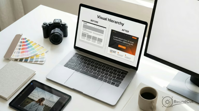
Visual Hierarchy: 7 Design Rules for 2026 (Tested on UX)
Visual hierarchy is the strategic arrangement of elements to guide human attention across a layout in a specific order. By using size, contrast, spacing, and typography, designers create a clear path for the eye. This ensures you notice the most important information first, understand relationships quickly, and take action effortlessly.
You perceive bad hierarchy before you can even name it. A landing page feels noisy, or a pricing card looks vital but the signup button simply vanishes into the background. Imagine a product image that is sharp, yet the label, price, and CTA fight each other instead of working in harmony. The result is straightforward: you hesitate, scroll, and eventually leave. This friction ruins the user experience and drives potential customers away because they can’t find what they need.
Understanding what is visual hierarchy matters more than basic design theory suggests. It is not mere decoration; it is a strategic decision system for human attention. Stop asking how to make things prettier and start asking what you want the reader to notice first, understand second, and do third. Once you shift your perspective, the layout becomes much easier to fix. Clarity beats aesthetics every single time.
What is visual hierarchy in design?
Visual hierarchy is the deliberate ordering of elements so you can scan a page, understand relationships, and make decisions without mental strain. A neutral baseline definition from visual hierarchy explains it as a perceived order of importance created through contrast. In 2026, digital interfaces rely on this to manage the overwhelming amount of data shown to users. But this order does not come from size alone; it comes from multiple levers working together. Proper structure is part of broad information architecture, ensuring that content remains scannable.
Strong visual hierarchy relies on controllable pillars: size, contrast, spacing, alignment, and typography. Each maps to a specific outcome. Size drives noticeability, while contrast handles emphasis. Spacing creates logical grouping, alignment builds trust, and typography sets the reading rhythm. Since these principles are the foundation of professional layouts, you must choose which lever matches your specific problem. For example, if users miss a CTA, you might increase contrast or isolate it with negative space rather than just making it bigger.
The Three Layers of Attention
A useful way to think about these principles is through layering. Every section needs a focal point, a support layer, and a utility layer. If all three scream at once, nothing wins. It fails. You need to remember that stronger hierarchy isn’t always better. If every card on a dashboard uses oversized numbers and heavy borders, the screen becomes exhausting. Balance is the goal. You want enough emphasis to guide the gaze, but not so much that the interface turns into a visual alarm.
- Focal point: The headline, primary image, or main action button.
- Support layer: Subheadings, proof points, or product details.
- Utility layer: Footer links, tags, and secondary metadata.
- Reading patterns: Utilizing the F-pattern for text or Z-pattern for visual layouts.
What principles create strong visual hierarchy?
Creating a readable layout requires a firm grasp of how the human eye moves. You must follow accessibility best practices to ensure that your contrast ratios allow everyone to navigate your site. This isn’t just about color; it involves the scale and proximity of related items. When you use these levers correctly, you reduce cognitive load and help users reach their goals faster. It works well.
To help you decide which tool to use, follow this decision framework for the five main levers of hierarchy. Each has a specific risk and an intended result on user behavior. It matters to pick the right one for the job.
| Lever | Best Use Case | Risk | Expected Effect |
|---|---|---|---|
| Size | Main Headlines | Overcrowding | Immediate attention |
| Contrast | Primary CTAs | Visual noise | High emphasis |
| Spacing | Grouping elements | Disconnection | Logical flow |
| Alignment | Form fields | Rigidity | Perceived trust |
| Typography | Reading rhythm | Legibility issues | Better scanning |
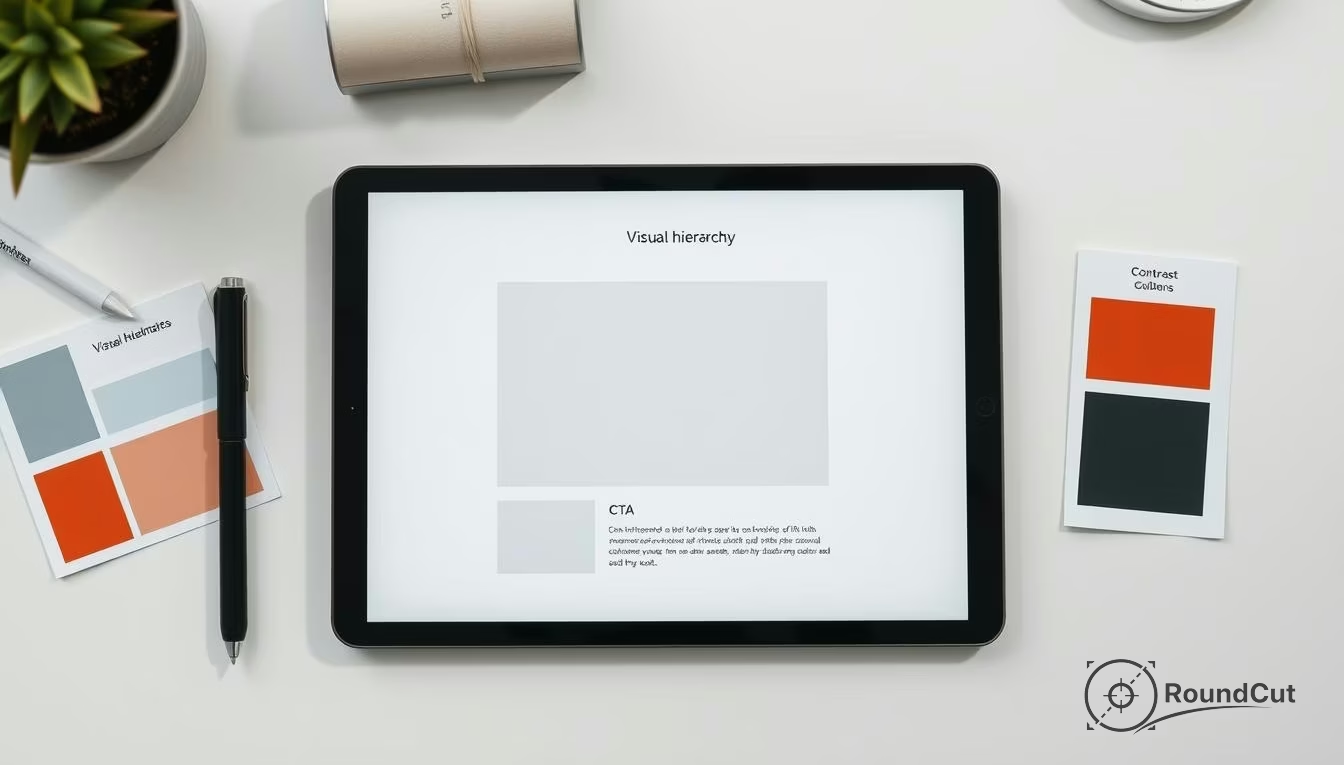
What are examples of good visual hierarchy?
Good visual hierarchy makes the next action obvious without forcing you to study the layout. In a checkout flow, the shipping total and ‘Continue’ button should dominate everything else. Still, many designs fail this simple test. Imagine an e-commerce page where the ‘Add to Cart’ button is the same color as the ‘Back to Category’ link; that is a classic case of weak hierarchy that breeds indecision.
If you work with profile images, this becomes very practical. A tool like the circle crop tool only feels effortless when the preview, crop frame, and confirm action are visually prioritized in that order. If the export options look as loud as the crop area, the editing flow feels harder than it actually is. Besides, if you want another perspective on this from a UX angle, you should read these visual hierarchy principles in UX. They provide a solid framework for testing your assumptions.
The Squint Test and Priority Audits
You can diagnose weak hierarchy with three quick checks: the 3-second test, the squint test, and the priority audit. If the main message disappears when you blur your eyes, your contrast is off. Then again, if the page still looks busy when you remove color, your spacing and alignment need work. Even though it sounds simple, a priority audit—where you list the top three elements a user should notice and compare them to the actual layout—is often the fastest way to find a fix. Worth it.
- E-commerce: Hero product image dominates while price is secondary.
- SaaS: Highlighted pricing column for the ‘Most Popular’ plan.
- Blog: Large H1 followed by smaller, well-spaced H2s.
- Mobile: Bottom-bar navigation clearly separated from content.
How do you create visual hierarchy step by step?
Creating visual hierarchy is mostly a sequencing problem. The first step is to define one primary action or message per screen. Not three, and not ‘let the user decide.’ One. Since teams often ask what is visual hierarchy only after their conversion rates drop, you should plan the logic before the pixels. Build the page in layers, starting with content order before you touch colors or fonts. Not always simple.
- Define the outcome: Click, read, compare, or submit.
- List content in priority: Order your items before styling them.
- Assign one primary lever: Choose size or contrast as your leader.
- Demote the rest: Reduce noise by muting tertiary items.
- Test for mobile: Ensure the order holds up on small screens.
Cleaning assets for better focus
Your image choices directly support or destroy hierarchy. If a hero image is visually cluttered, your text will never win. In that case, using a background remover or the Araluma crop image tool can simplify the composition. Also, if you have a low-quality asset, use an AI image upscaler to ensure it doesn’t look blurry, as poor quality often draws negative attention. While these edits seem minor, they ensure your focal point remains sharp and relevant. Proper asset management keeps the user focused.
How is visual hierarchy different in UI, web, and graphic design?
Visual hierarchy changes by medium because attention behaves differently on a dashboard versus a static poster. In UI design, hierarchy must support interaction. In web content, it must support scanning and reading depth. Graphic design, meanwhile, often has to communicate from a distance. While the core principles remain, the pressure points shift depending on the user’s goal. Knowing what is visual hierarchy in each context is vital for success.
In UI, buttons and alerts need unambiguous emphasis because functional clarity beats style. Yet in web articles, hierarchy depends heavily on headings and spacing to prevent reading fatigue. This is where technical performance matters too; a clean hierarchy that loads slowly feels broken. Using an image compressor ensures your visual structure doesn’t cause layout shifts or slow LCP scores. If you want to dive deeper into marketing specifically, check this breakdown of visual hierarchy for marketing.
- UI hierarchy: Minimize wrong clicks through alignment and clear buttons.
- Web hierarchy: Minimize reading fatigue through typography and H-tags.
- Graphic hierarchy: Minimize hesitation through aggressive scale and color.
- Data Viz: Focus on the trend-line first, then the specific data points.
When to simplify: Reducing noise for better focus
You should reduce hierarchy when a design feels loud or emotionally tiring. Not every problem needs a bigger headline or a brighter button. Sometimes the smartest fix is to calm the page down so the real priority can breathe. Noise is the enemy of focus, and if everything looks urgent, you actually see nothing useful. It depends on the goal. Simplification often yields better results than adding more decoration.
A common failure is ‘stacked emphasis’ where you use a bold headline, a bright badge, and an animated button all in one spot. This signals fear, not clarity. Instead, remove a few layers, standardize your secondary styles, and let spacing do the work. If you are handling many assets, consider a format converter to keep your file sizes uniform and efficient, which also helps the overall layout feel ‘lighter’ and faster for the user. When implementing FAQs, you can follow Google FAQ structured data guidance to maintain search clarity.
- Remove secondary borders to let items breathe.
- Use a single accent color instead of three.
- Increase whitespace between unrelated sections.
- Check if a paragraph can be a short bulleted list.
“If everything looks the same, then you see nothing.”
— Miguel Cardona, Figma
Visual hierarchy is not a one-time task; it is a continuous refinement process that adapts to how people actually use your site. By mastering what is visual hierarchy and its five levers—size, contrast, spacing, alignment, and typography—you can transform a cluttered mess into a high-converting experience. Unless you prioritize the user’s ability to scan and understand, your design will always feel like an obstacle.
Start applying these principles by running a squint test on your most important page today. Identify where the attention is leaking and use spacing or contrast to bring it back to the primary action. A clear path not only improves engagement but also builds long-term trust with your audience. Good design is transparent design.
If your next step is learn what matte painting is and how to create one in photoshop with our 4-step guide. master combining images, matching colors, and painting details, What is Matte Painting? A 4-Step Guide for Photoshop is a dedicated option for that workflow.
FAQ
What is visual hierarchy?
Visual hierarchy is the arrangement of design elements in order of importance to guide the user’s eye. It uses size, color, and spacing to create a clear path for information processing.
Why does visual hierarchy matter for UX?
It reduces cognitive load by making layouts scannable and intuitive. Without it, users struggle to find the primary action, leading to frustration and high bounce rates.
What is the squint test in design?
The squint test involves blurring your vision to see which elements stand out most. If the most important item isn’t visible when blurred, your visual hierarchy needs more contrast.
How do size and contrast affect attention?
Size creates immediate noticeability for large elements like headlines. Contrast creates emphasis, allowing specific items like buttons to stand out against the rest of the layout.
What are the common mistakes in visual hierarchy?
The most common error is ‘stacked emphasis,’ where too many elements try to be the focal point. This creates visual noise that overwhelms the user and hides the actual priority.
Crop images into a circle for free