Image Optimization for Ecommerce: Crop, Background, Format First
Start With the Silent Conversion Killers: Crop, Background, Format
Most ecommerce “image optimization” advice starts at the end: compression sliders. I don’t. In real storefront audits, the biggest damage usually comes earlier—bad crops, inconsistent aspect ratios, messy backgrounds, and the wrong format for the job.
Those mistakes don’t just look off. They create blurred thumbnails, awkward circular crops, layout shifts that make taps miss, and slow pages where your biggest image becomes the bottleneck. Fixing them is how you protect Core Web Vitals and make your catalog feel trustworthy.
Quick reality check: if you upload a 2000×2000 image but render it as a 400×400 thumbnail, you’re pushing 25× more pixels than you need. Compression helps, but it can’t undo a crop that hides the product, a background that adds noise, or a format choice that bloats every tile in your grid.
A simple decision tree (use this before you compress)
- Crop (pick a consistent ratio per placement)
- Background (clean edges, consistent tone, shadow rules)
- Format (WebP vs AVIF, and when PNG still wins)
- Compress (only after the visual decisions are locked)
- Deliver responsively (
srcset/sizesso mobile doesn’t download desktop)
We’ll go through each step with ecommerce-specific targets (collection vs PDP) and the tradeoffs that actually matter when you ship: what to standardize, what to test at thumbnail size, and what to leave alone so product detail still sells.
Compression Is Last: Lossy vs Lossless (and How Re-Exports Ruin Product Photos)
A few months ago, a creator sent us a “sharp” hero photo that looked fine in Lightroom… and awful on their Shopify collection grid. The issue wasn’t the camera. It was a lossy chain: export → re-export → app upload → platform optimization. By the time it hit the storefront, edges were ringing and small text on packaging turned to mush.
Lossless and lossy aren’t moral choices. They’re tools. The ecommerce rule is simple: keep one clean master, and don’t let your storefront pipeline be the third (or fourth) time the same pixels get thrown away.
When lossless is the right call
- Logos, icons, UI-like graphics: hard edges and flat colors punish lossy artifacts. PNG is still common here.
- Transparency you truly need: product cutouts, overlay elements, stickers. (WebP/AVIF can also do transparency, but your pipeline needs to support it end-to-end.)
- Assets you’ll edit again: keep a clean master to avoid generational damage.
When lossy is usually better
- Photos on PDP and collections: product photos tolerate gentle loss well, and the byte savings are real.
- Large hero banners: they’re often the biggest element on the page, so size matters.
The ecommerce-specific trap: “transparent background” PNGs everywhere
People default to PNG because it “looks clean.” But if you don’t need transparency (white background, solid color, or a full-bleed photo), PNG often bloats file size with no conversion upside. That can turn your category grid into a download party on mobile.
Practical workflow that prevents the re-export problem: keep one master (RAW/PSD/TIFF), export once per placement (grid, PDP main, thumbnails), and don’t run “optimizers” on already-lossy exports unless you’re checking the result at the smallest thumbnail size you ship.
Cropping for Devices: Why Your Grid Looks Blurry on iPhone

Why do your images look sharp on desktop, but soft in a collection grid on an iPhone 15 Pro?
Because the grid is doing more resizing than you think—often from the wrong crop. If your source aspect ratios are inconsistent, platforms will auto-fit, auto-crop, or stretch into containers. That leads to “mystery blur” and, worse, layout shifts when the browser doesn’t know the final height up front.
A practical target system (collection vs PDP)
| Placement | Goal | Typical aspect ratio | What to avoid |
|---|---|---|---|
| Collection / category grid | Fast scanning, consistent tiles | 1:1 or 4:5 | Mixed ratios that force crop per tile |
| PDP gallery (main image) | Detail + confidence | 1:1 (common) or 4:5 | Over-zoomed crop that hides scale |
| PDP thumbnails | Clean navigation | Match main | Busy backgrounds, inconsistent margins |
The CLS problem competitors skip: cropping errors create layout shift
If your template reserves space for a 1:1 image but the delivered image ends up closer to 4:5 (or vice-versa), the browser may reflow once the real dimensions are known. That’s a Core Web Vitals hit and a UX hit: the user tries to tap a swatch or “Add to cart,” the layout jumps, and the tap lands somewhere else.
Fix it at the source: export to a single aspect ratio per placement, and make sure the HTML reserves the right box. (More on that in the responsive section.) For a broader checklist-style view, this guide covers the general workflow steps many teams follow: Web image optimization best practices.
Circular Crops + Consistent Ratios: Design for the Mask, Not the Photo
Contrarian take: circular crops aren’t a “style choice.” They’re a constraint you must design for, or you’ll ship accidental amputations—cut-off packaging, missing faces, chopped product edges.
Any marketplace or theme that uses circles (avatars, brand marks, “quick view” tiles) is applying a mask. If your image isn’t composed with a safe area, the mask will do damage.
A simple safe-area rule you can use today
If the circle fits inside a square tile, the corners of the square are guaranteed to be cut. So don’t place critical details near the corners. Keep the important product silhouette and any readable label inside the central region of the square (think “center-weighted composition,” not edge-to-edge).
What “consistent aspect ratio” actually means in ecommerce
- Same ratio, same margins: two products can both be 1:1 and still look inconsistent if one is tight-cropped and the other has lots of whitespace.
- Same horizon/angle: if you mix top-down with eye-level shots in the same grid, it reads like a reseller catalog, not a brand.
- Same background tone: pure white (#FFFFFF) vs warm white can make a collection page look patchy.
Mini-checklist for circular tiles
- Export a square version specifically for the circle use-case (don’t rely on auto-crop).
- Center the product; leave breathing room.
- Test in the smallest size you ship (e.g., a 64 px avatar) before you call it done.
This is one of those areas where “optimize” is mostly visual decisions, not file math—and it shows up immediately in click-through on collection pages.
Background Removal for Clean PDP Thumbnails (Without Halo Hell)
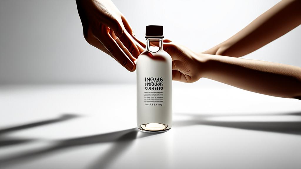
Background removal is the fastest way to make a PDP feel premium—especially on thumbnails where every pixel matters. But sloppy cutouts create the exact opposite effect: halos, jagged edges, and weird color fringing around hair, glass, or reflective products.
A real-world scenario
Take a 3-inch (7.6 cm) skincare bottle with glossy edges. If your cutout has a 2–3 px halo, the thumbnail looks like it was stolen from a marketplace listing. On retina screens, that halo is painfully obvious.
Practical do’s and don’ts (ecommerce edition)
- Do remove backgrounds for collection tiles when your product silhouette is strong (bottles, shoes, electronics).
- Do keep a soft shadow (even subtle) so the product doesn’t float.
- Don’t force removal for fuzzy edges (fur, fine hair) unless you have time to refine the mask.
- Don’t export a cutout with transparency if your storefront always places it on white—use a solid background and pick a photo format that compresses well.
PDP vs collection: different targets
Collection images need legibility at small sizes. PDP images need trust at large sizes. That means your collection cutout should be cleaner and simpler, while your PDP gallery can keep more context (a hand holding the product, a lifestyle shot) as long as the first image is clear.
If you’re building a repeatable workflow, treat background as a “brand asset.” Set a standard: white sweep, neutral gray, or a consistent colored backdrop, and enforce it like you enforce typography.
WebP vs AVIF + Responsive Images: Ship the Right Bytes, Every Time

Format choice isn’t a nerd flex. It’s how you stop mobile users from downloading desktop assets.
WebP vs AVIF (practical guidance)
- WebP: a safe default for most product photos and thumbnails when your pipeline needs broad compatibility and fast encoding.
- AVIF: often smaller at similar perceived quality for photographic content, but can be slower to encode and not always worth it for every asset type.
- PNG: keep it for true edge cases: crisp UI graphics, simple transparency needs, and assets where artifacts are unacceptable.
Don’t chase the smallest KB if the image ends up looking cheap. A “tiny” file that makes your hero photo look smeared costs more than it saves.
Responsive images: the part that actually protects Core Web Vitals
If you only do one technical thing from this article, do this. Use srcset and sizes so the browser chooses the right file for the viewport.
<img
  src="/img/product-800.webp"
  srcset="/img/product-400.webp 400w, /img/product-800.webp 800w, /img/product-1200.webp 1200w"
  sizes="(max-width: 600px) 90vw, (max-width: 1200px) 50vw, 600px"
  width="800" height="800"
  alt="Black leather wallet with zipper" />
Two details matter more than people admit:
- Always set
widthandheight(or CSS aspect-ratio): this is how you reserve space and avoid layout shift when images load. - Match the aspect ratio to the slot: don’t send 4:5 into a square box and hope CSS will save you.
If your stack supports it, serve AVIF/WebP via <picture> (AVIF first, WebP fallback), but don’t add complexity until you’ve verified it actually changes LCP on your real pages.
Accessibility + SEO basics tied to sales
Alt text and filenames aren’t busywork. They’re how you keep images useful when they don’t load, and how your products show up in image search results that buyers actually use. Use plain descriptions that match how someone would shop: “women’s red linen dress front view,” not “IMG_4839.”
A realistic quality threshold (stop over-optimizing)
If your product texture (fabric weave, matte finish, fine print) starts to break, you pushed too far. The goal is “fast enough without looking discounted,” not “smallest possible file.” In practice, I’d rather ship a slightly heavier main PDP image than destroy the details that answer a buyer’s last doubt.
FAQ
How do I optimize images for web without losing quality?
Start by fixing the crop and background so the image reads well at the size it will be displayed. Then export to the right dimensions, pick WebP or AVIF for photos, and compress until you see visible texture loss—then back off slightly.
What’s the fastest way to stop blurry thumbnails on collection pages?
Standardize your aspect ratio (like 1:1 or 4:5) and export a dedicated set of grid images at the exact slot size your theme uses. Blurry thumbnails usually come from platform resizing a mismatched crop or scaling up a too-small source.
When should I use AVIF instead of WebP?
Use AVIF when your pipeline supports it and you’re optimizing photographic content where smaller files help page speed. Stick to WebP when you need a simpler workflow, faster encoding, or you’re mixing many asset types and want one reliable default.
Why does image cropping affect Core Web Vitals?
If the browser can’t predict the final image box (wrong aspect ratio, missing dimensions), the layout can reflow when the image loads. That creates layout shift and can make clicks miss—bad for UX and for the metrics search engines care about.